
Top Bathroom Vanity Color Ideas
Ready to give your bathroom an effortless glow-up? These bathroom vanity color ideas blend style and practicality to help you refresh your space—whether you’re aiming for spa-like serenity, modern contrast, or cozy, earthy warmth. From timeless whites to bold blacks, soothing blues, and on-trend greens, the right shade can redefine the entire room.
Choosing a vanity color is about more than a paint chip. Consider your lighting, countertop and tile undertones, and hardware finishes to create a cohesive palette that feels intentional. Think durability too—semi-gloss or satin finishes resist moisture, while lacquered looks dial up the drama in powder rooms.
In this list, you’ll find classic neutrals, rich jewel tones, organic wood stains, and chic two-tone combinations that work in small bathrooms, primary suites, and guest spaces alike. Get inspired by pairings that complement marble or quartz, patterned floors, brass or matte black hardware, and everything in between—so your vanity becomes the design anchor your bathroom deserves.
Timeless Bathroom Vanity Colors and Finishes
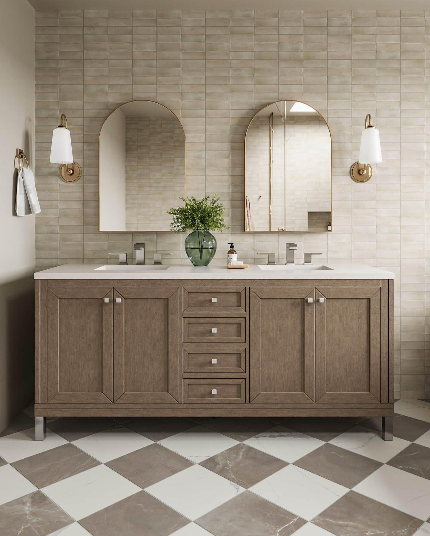
Neutral bathroom vanity colors create a timeless foundation that adapts to changing trends and different lighting conditions. Warm whites, greige, and soft taupe complement most tile undertones and lend a serene, spa-like mood. Light-reflectance values matter; higher LRV paints brighten small bathrooms, while mid-tone neutrals add depth without feeling heavy. Natural wood stains like white oak or walnut introduce organic texture that softens sleek stone or porcelain surfaces. These shades partner effortlessly with brushed nickel or champagne bronze hardware, extending flexibility for future refreshes.
- Warm White: Cream-leaning white keeps spaces crisp yet cozy, reflecting light without stark glare. Pairs beautifully with marble-look quartz and warm brass fixtures for balanced, inviting contrast.
- Greige: A balanced greige bridges cool gray tile and warm flooring, preventing clashes. Works with both chrome and champagne bronze hardware, easing future design tweaks and accent changes.
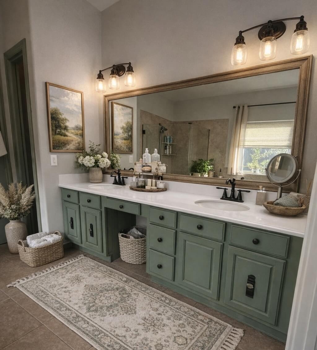
- Sage Green: Soft, muted green introduces calm color while staying versatile. Complements white quartz, aged brass, or matte black, and brings a biophilic, spa-like note to contemporary bathrooms.
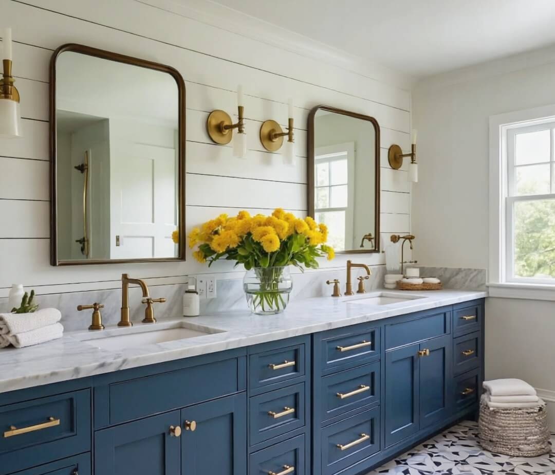
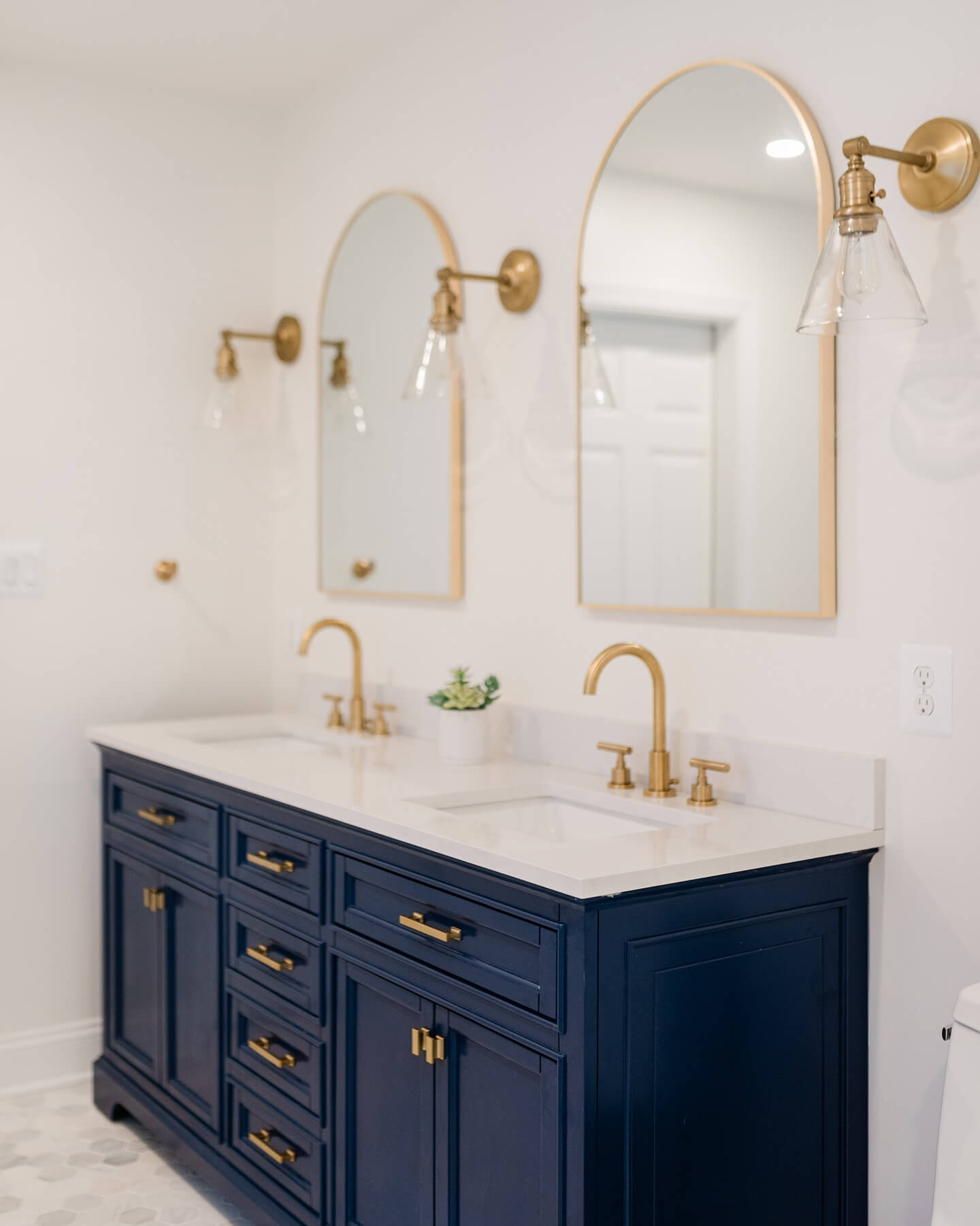
- Navy Blue: Rich navy delivers classic contrast against white walls and counters, grounding airy rooms. It suits coastal, traditional, and modern styles, especially with polished nickel or brass.
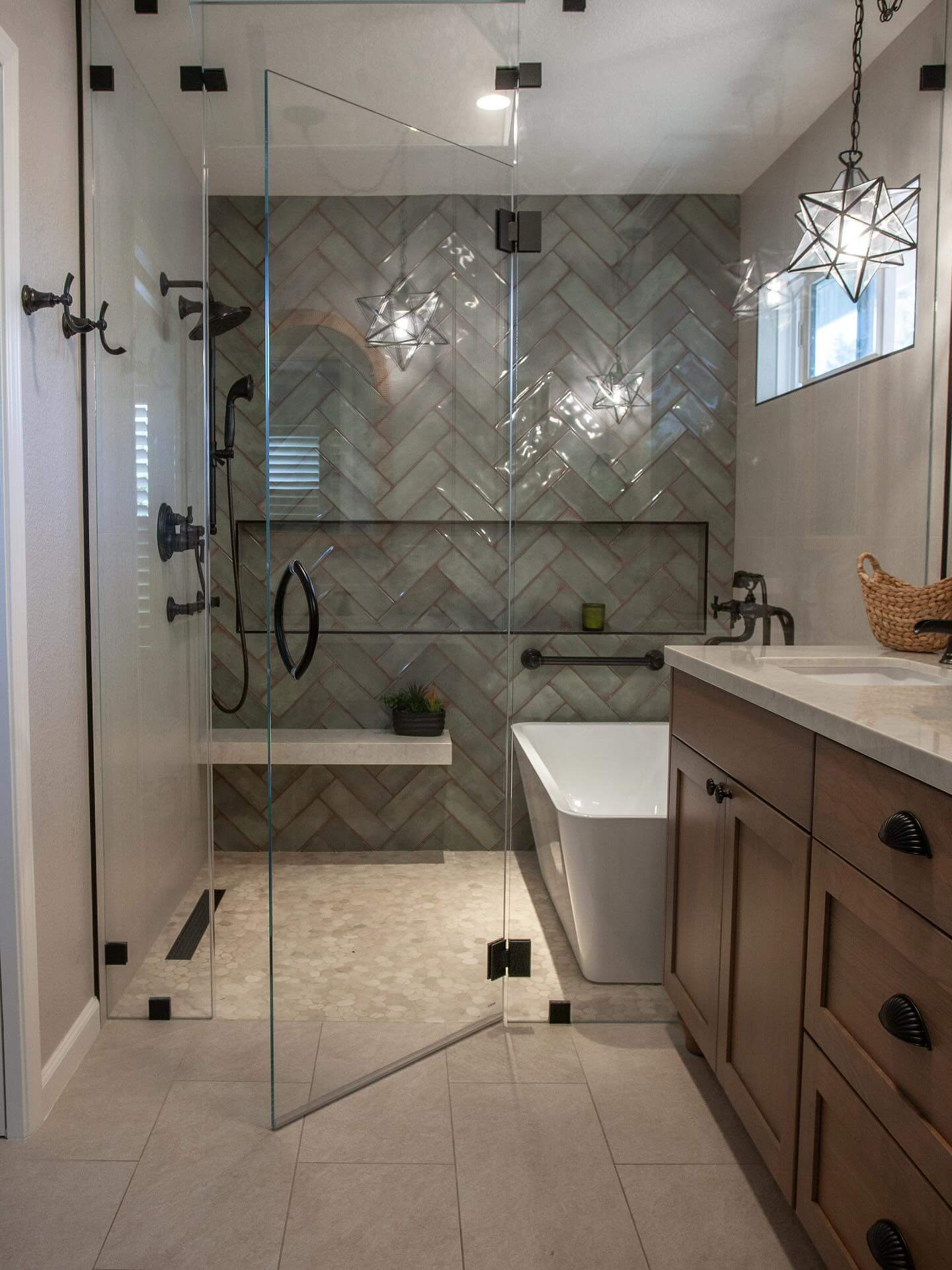
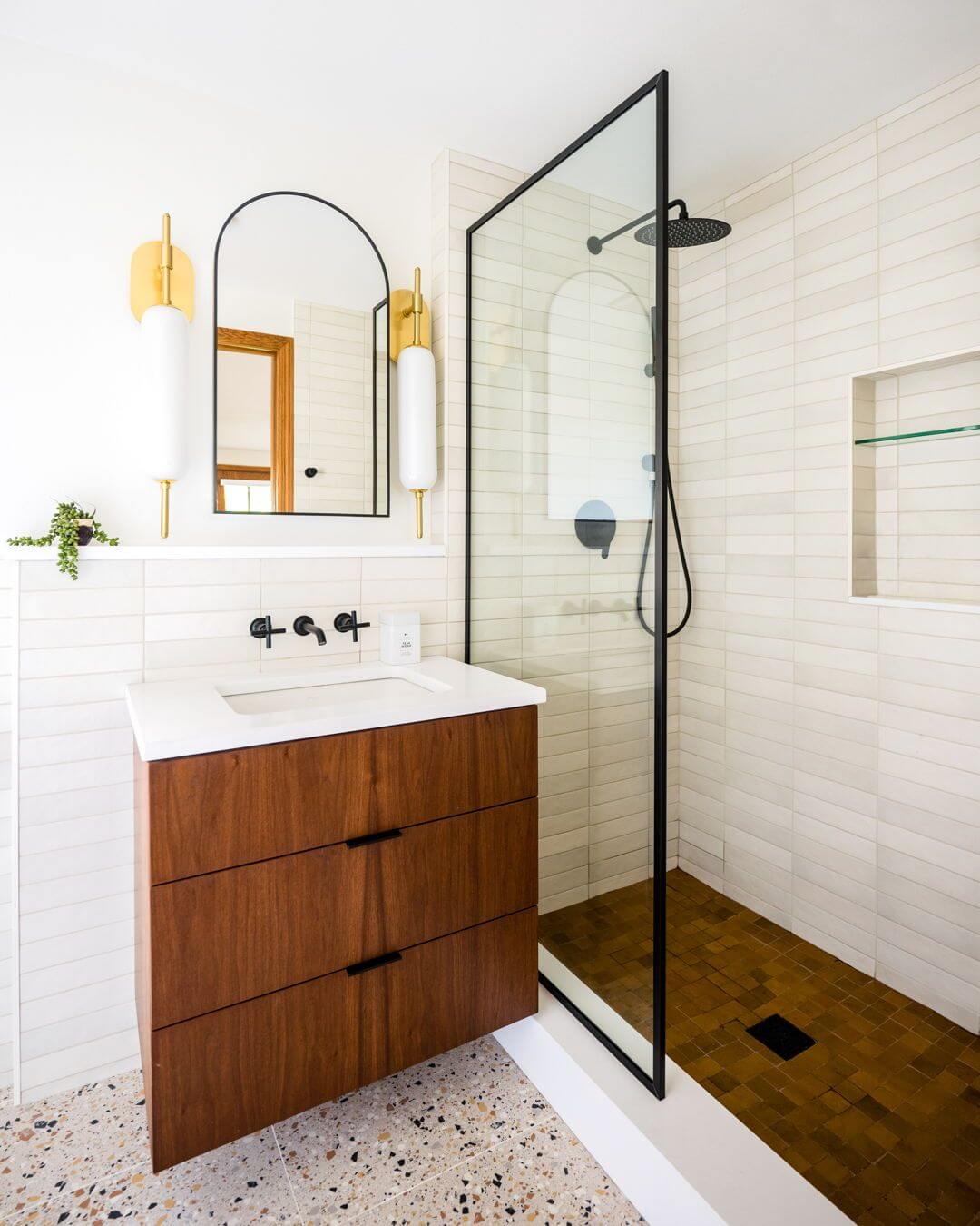
- Matte Black: Inky cabinetry feels sophisticated and sculptural, best with ample lighting and lighter floors. Showcases hardware finishes, stone veining, and textured tile while hiding minor scuffs.
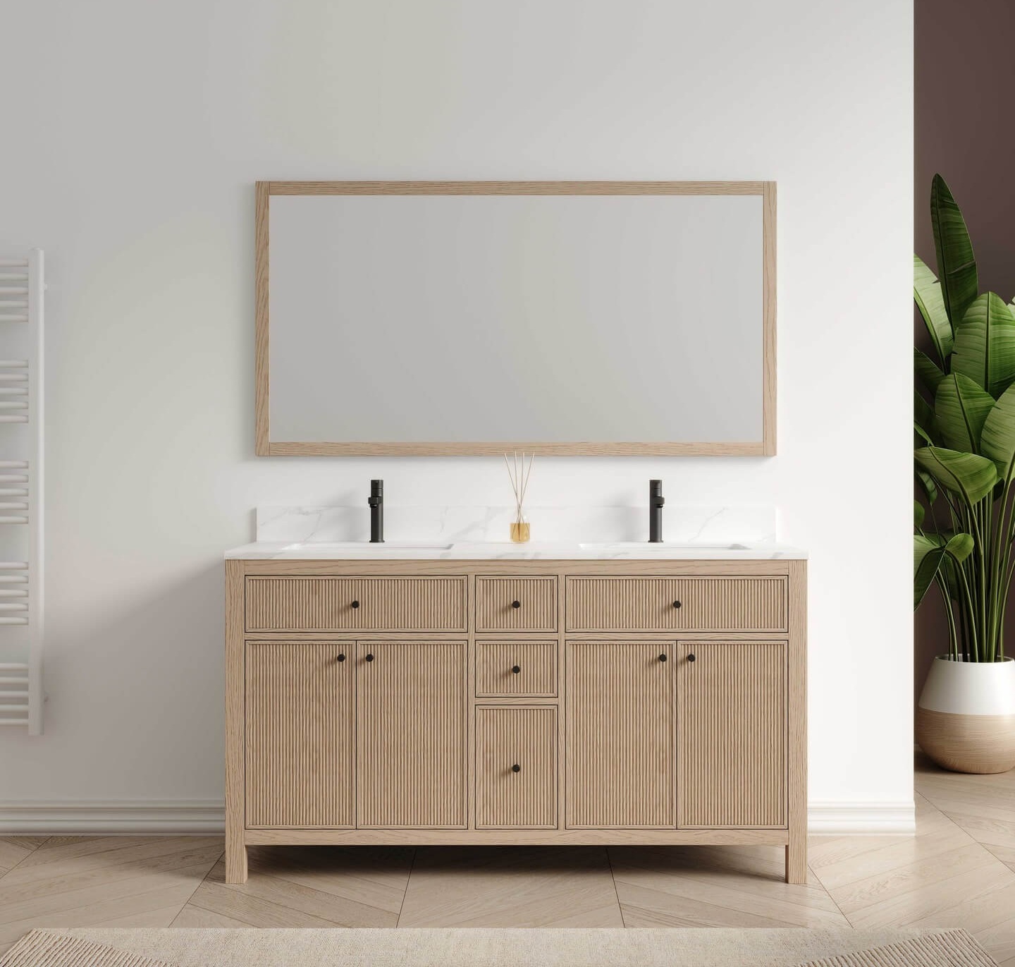
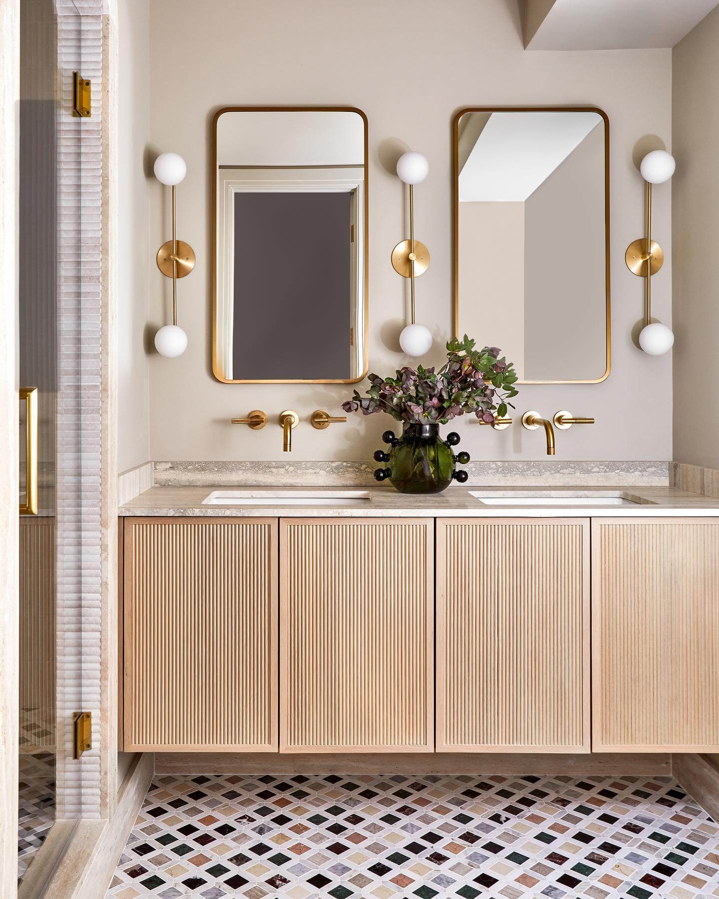
- Natural Oak: Light oak stain highlights grain and adds warmth, pairing well with cool stones. Ideal for Scandinavian, Japandi, or organic-modern bathrooms seeking softness without visual clutter.
Finish selection shapes both durability and look; satin or matte hides imperfections, while semi-gloss resists moisture and cleans easily. Tie paint undertones to countertop veining and shower tile for cohesive flow. Mix metals thoughtfully—one dominant finish and one accent—so colors read intentional rather than mismatched. In compact rooms, contrast vanity tone with floor or wall tile to define the silhouette. Always test large swatches in morning and evening light to confirm undertones before committing.
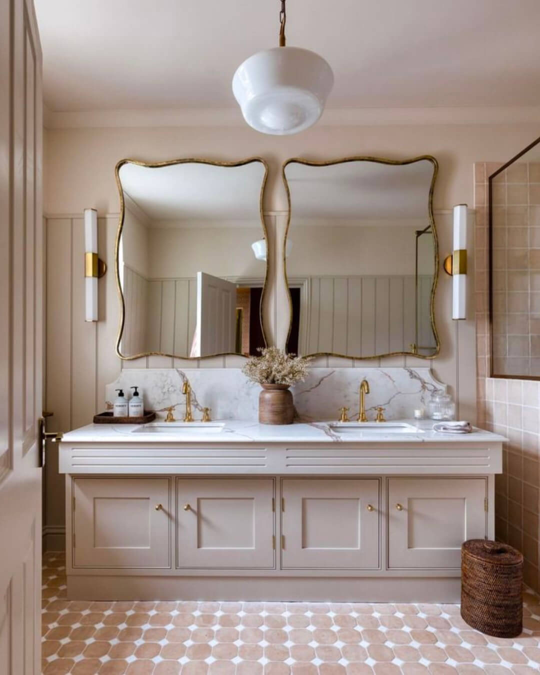
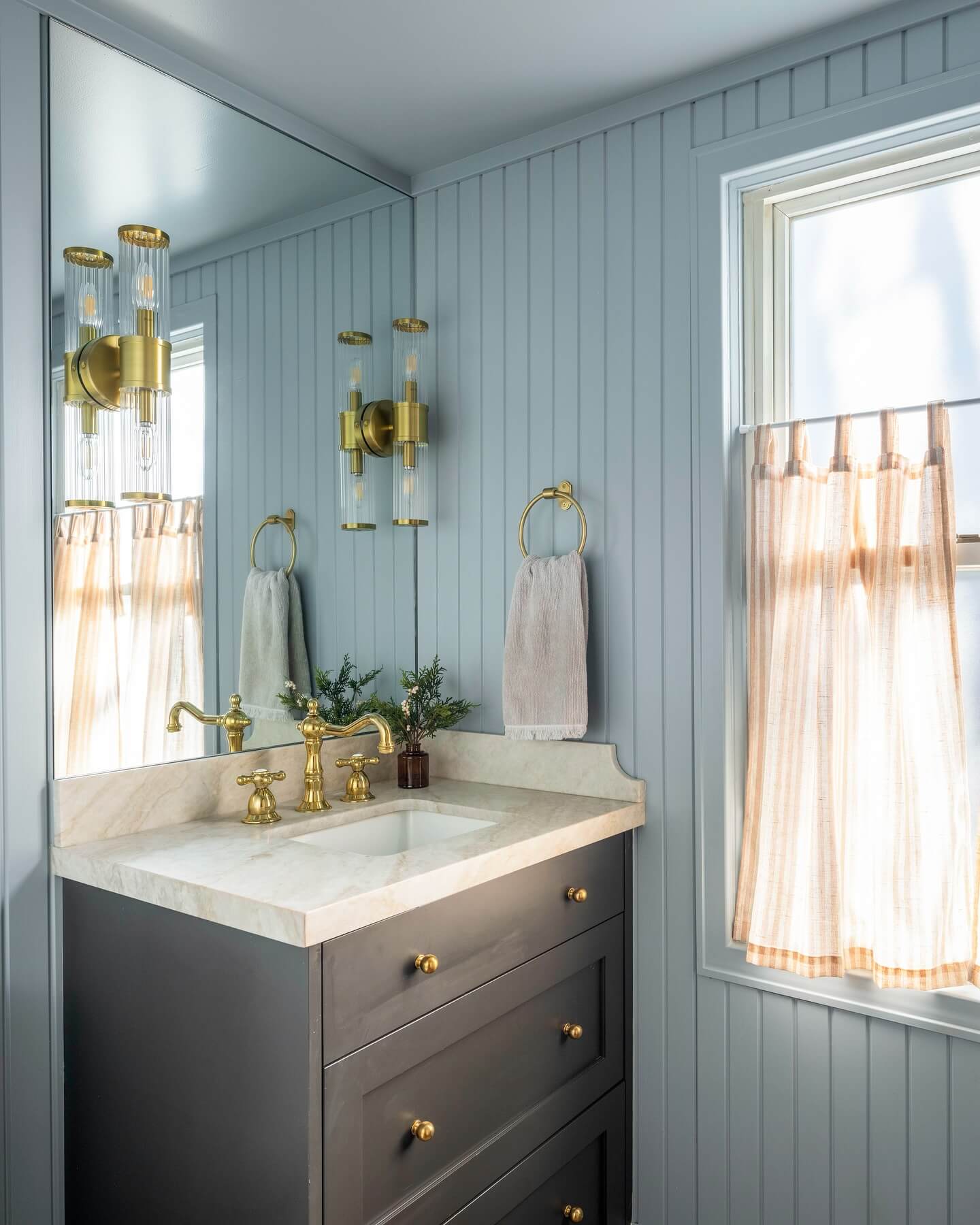
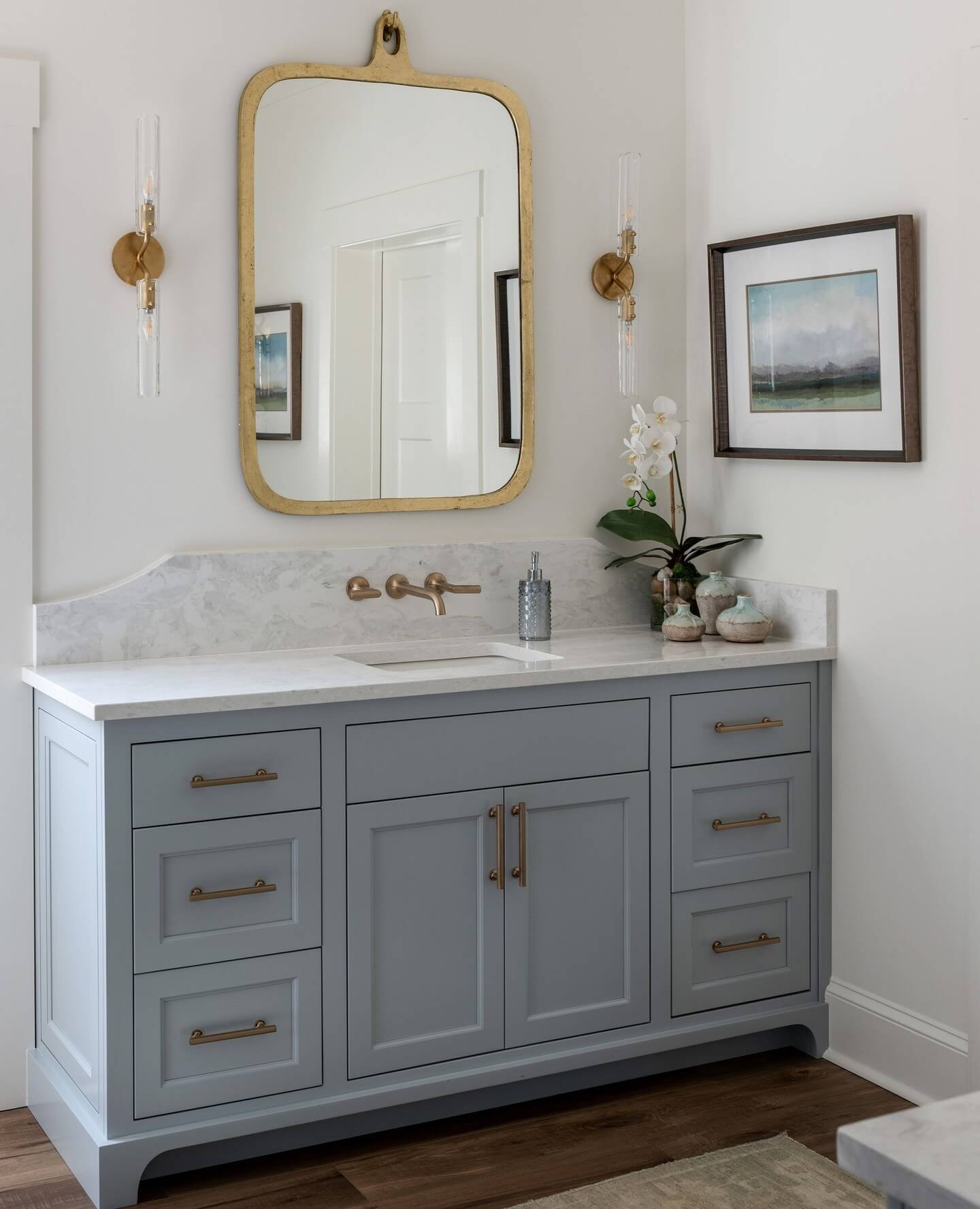
Soft Greige Vanity for Effortless Warmth
If you want a bathroom that feels calm yet elevated, a soft greige vanity is a foolproof choice. This nuanced neutral blends warm beige with cool gray, so it plays nicely with both crisp whites and earthy textures—a smart move when your tile, grout, or countertop undertones are a mixed bag. Pair greige cabinetry with marble or marble-look quartz to keep things airy, or lean cozy with honed limestone, travertine, or warm terrazzo. For hardware, brushed nickel keeps it serene; unlacquered brass adds a subtle glow; matte black introduces modern edge. In small bathrooms, a satin or semi-gloss finish reflects light without feeling shiny. For walls, try a warm white with a similar undertone (think creamy, not blue) to avoid clashing. Add ribbed glass sconces and a soft linen roman shade to layer texture without visual noise. Pro tip: sample two greige paints—one cooler, one warmer—in your actual lighting. That quick test ensures your bathroom vanity color looks intentionally curated morning to night.
Navy is the shortcut to luxe in a bathroom vanity—dramatic but timeless, moody yet surprisingly versatile. A deep navy cabinet grounds bright tile and amplifies veining in marble counters, creating the kind of high-contrast palette that never reads trendy. If your bathroom skews classic, pair navy with polished nickel and airy white walls. Want extra warmth? Unlacquered brass hardware and picture lights bring a rich, collected feel as the metal patinas. Keep the look cohesive with black or navy-framed mirrors and crisp white linens. In tighter spaces, balance the depth with high-reflectance elements: glossy subway tile, a light counter, and clear-glass sconces. For paint, choose a durable satin or enamel to resist moisture and wipe clean easily; look for navies with a whisper of green or black for sophistication (not royal blue). Navy fits coastal, transitional, and modern styles alike—proof that the right bathroom vanity color idea can anchor a whole design plan.
Sage Green Serenity for a Spa-Like Reset
Sage green is the wellness color for bathrooms—soft, herbal, and instantly soothing. A sage vanity bridges indoor-outdoor living, echoing eucalyptus and olive notes while staying neutral enough to outlast trends. Pair with natural textures like rattan, woven baskets, ribbed towels, and travertine or tumbled stone for organic depth. If you prefer a cleaner look, offset sage with white zellige tile and a thin, marble edge profile for spa clarity. Hardware matters: matte black sharpens the palette; brushed brass warms it; brushed nickel keeps it quietly polished. To stay cohesive, repeat the green’s undertone in wall paint (muted greige-greens read elevated) and select light fixtures with opal glass to diffuse light gently. A satin or semi-matte cabinet finish enhances the calming vibe while concealing minor scuffs. For extra zen, add a eucalyptus shower bundle and a low-profile runner. This bathroom vanity color idea turns morning routines into rituals—and powder rooms into small sanctuaries.
Matte Black Vanity, High-Contrast Modern
When you want instant architecture, go matte black. A black vanity delivers crisp lines, frames the space, and makes even simple mirrors and sconces feel curated. The key is balance: pair deep cabinetry with light, reflective surfaces—white quartz, glazed tile, or micro-fluted glass—to keep the room from feeling heavy. In modern bathrooms, black-on-black hardware is sleek and minimal; for transitional spaces, aged brass or polished nickel adds warmth and dimension. Because fingerprints show on true matte, consider a velvet-matte or satin enamel that’s easier to clean while staying low-sheen. Light temperature matters too: warm 2700–3000K bulbs prevent the black from skewing cold. If your bath is small, extend the vanity color onto a tall storage tower to streamline sightlines, then bounce light with an oversized mirror. This bathroom vanity color idea thrives on contrast—think black cabinet, white walls, striped Turkish towels, and a single walnut stool to soften the edges.
Warm Walnut Stain for Organic Modern Texture
Paint isn’t the only path. A warm walnut-stained vanity brings natural movement and texture through its grain, instantly warming sterile tile and chrome fixtures. This look suits organic modern, mid-century, and Japandi interiors, especially when paired with slim edge profiles, integrated pulls, and a honed stone top. Choose a stain that enhances, not masks, the wood’s pattern, and seal with a durable, humidity-resistant topcoat for longevity. Walnut plays beautifully with off-white walls, creamy limestone, and handmade tile—elements that highlight its warmth. For hardware, matte black adds graphic clarity; brushed brass brings glow; oil-rubbed bronze leans traditional. Keep lighting simple: linen-shaded sconces or opal globes soften the palette. If you want extra depth, wrap the mirror in wood or add a slatted shelf to repeat the tone. This bathroom vanity color idea is a masterclass in cozy minimalism—just enough color, loads of texture, and a finish that ages gracefully.
Powder Blue Coastal Calm That’s Still Grown-Up
Powder blue delivers that breezy, just-opened-the-windows feeling—without veering into nursery territory when you ground it thoughtfully. A powder-blue vanity paired with bright white beadboard, Carrara-look quartz, or glossy subway tile feels fresh and coastal. Swap in polished nickel or chrome to keep the palette crisp; add woven accents (a rattan stool, seagrass basket) for a relaxed layer. To maintain sophistication, choose a muted, grayed blue rather than a pastel, and consider a satin or semi-gloss finish that reflects light in small baths. If your floor has patterned cement tile, echo one of the cooler tones in the vanity for cohesion. Wall color tip: soft white with a hint of gray prevents the blue from reading too sweet. Finish with linen roman shades and clear-glass sconces to keep sightlines open. This bathroom vanity color idea is perfect for guest baths and kids’ spaces alike—calm, clean, and undeniably inviting.
Charcoal Gray with Veined Stone for Timeless Edge
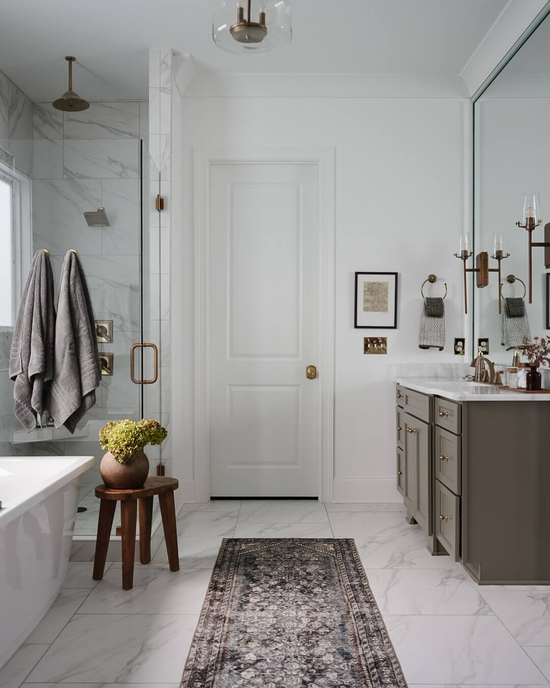
Charcoal is the sophisticated middle ground between black drama and gray practicality. A charcoal vanity adds depth without overwhelming, especially when you echo its cool undertone in veined marble, quartz, or porcelain slabs. For a timeless, hotel-chic vibe, pair charcoal with crisp white walls and polished nickel hardware; for moodier style, layer microcement walls, fluted details, and burnished brass. Because charcoal can skew blue or brown, sample swatches against your floor and shower tile first. Use a durable enamel finish to resist humidity and daily wear, and break up the mass with open shelving or a leggy base. Lighting is key: warm LEDs and opal shades soften the contrast, while prismatic glass introduces sparkle. Add plush towels in stone or putty and a low-profile rug for texture. This bathroom vanity color idea brings structure and polish—perfect for primary suites that need a classic, edit-proof palette.
Mushroom Taupe, the Quiet-Luxury Neutral
Mushroom taupe is the insider neutral—earthy, tailored, and endlessly adaptable. As a vanity color, it wraps the room in soft shadow, letting stone and metal finishes stand out. Think limestone counters, tumbled travertine floors, and unlacquered brass that slowly deepens with time. Keep walls a gentle off-white or a pale greige to avoid a heavy look, and add ribbed or reeded details for tactile interest. Mushroom’s beauty lies in undertone: choose a taupe with a hint of green or violet to harmonize with your tile. It’s also practical—midrange depth hides everyday smudges better than white. In powder rooms, a lacquered finish feels decadent; in full baths, satin strikes the right balance. Finish the scene with linen hand towels, a petite vintage lamp on the counter, and an antique-look mirror. This bathroom vanity color idea radiates quiet luxury—subtle, layered, and effortlessly elevated.
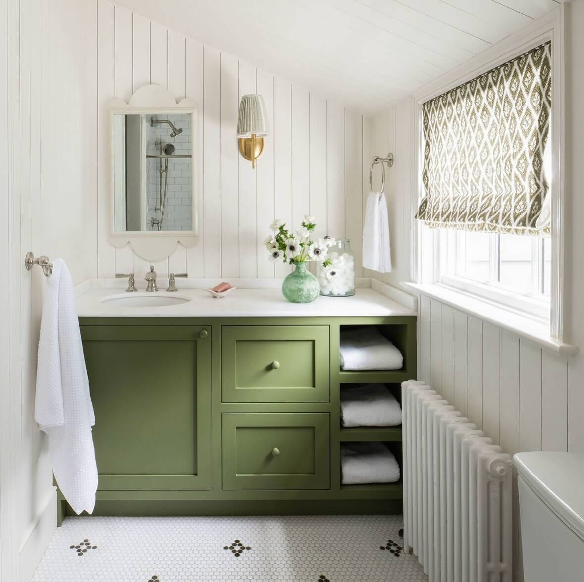
Heritage Forest Green with Aged Brass
For grounded, heritage character, go forest green. This deep, saturated vanity color reads bespoke, especially with inset doors, furniture feet, and aged brass hardware or gallery rails. Pair it with marble or soapstone counters to underline the richness, and consider checkerboard floors or beadboard for classic pattern. If your bathroom is compact, keep walls light and add a large, gilded mirror to bounce light; in larger spaces, lean in with creamy stone walls or paneled wainscot for clubby warmth. Forest green shifts with light—choose a formula with a touch of black for depth and sample near your shower tile to confirm undertones. Styling tip: layer vintage art, a Turkish runner, and pleated shades for a collected feel. This bathroom vanity color idea delivers instant gravitas while still feeling fresh—ideal for guest baths you want to feel memorable or primary suites that deserve a little drama.
Crisp White Vanity, Warmed with Wood Accents
A white vanity is the brightest path to a bigger-feeling bathroom—but the secret to avoiding “clinical” is warmth. Choose a soft white that complements your tile’s undertone (creamy for warm marble, clean for cool porcelain), then layer in wood: oak drawer fronts, a walnut-framed mirror, or cane panels. This mix adds depth and a custom look without sacrificing lightness. Hardware can steer the vibe—brushed brass for warmth, chrome for spa-clean, matte black for contrast. White cabinetry shines with semi-gloss or enamel finishes for easy wipe-downs; just soften the gloss with honed counters and woven textiles. If you want dimension, try a two-tone approach: white uppers or tower with a pale wood base. Add micro-fluted or reeded details for shadow play, and keep lighting warm (2700–3000K) so whites don’t go icy. This bathroom vanity color idea is universally flattering—bright, adaptable, and easy to refresh with seasonal accents.
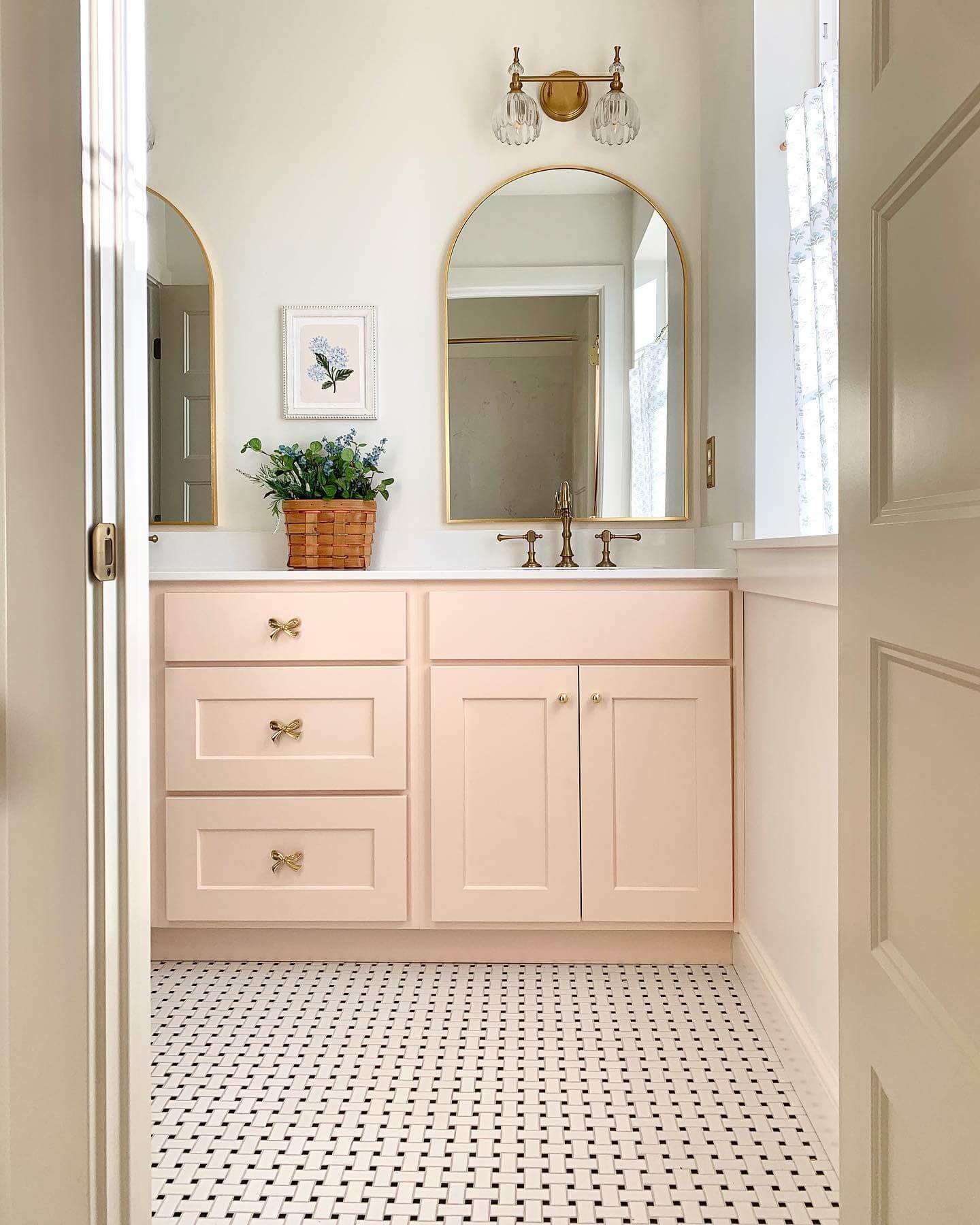
Blush Beige Vanity, Elevated Neutral Warmth
If you’re craving warmth without committing to brown, blush beige is a refined middle ground that flatters every bathroom. This nuanced neutral reads like a soft “nude” on a vanity cabinet—subtle pink and peach undertones bring skin-friendly glow while keeping the palette sophisticated. In bright spaces, a blush beige vanity reflects light and feels airy; in windowless baths, it adds warmth where stark white might fall flat. Pair it with creamy quartz or Calacatta Gold marble to echo the tone, then layer unlacquered brass or champagne bronze hardware for an elegant, low-contrast finish. For walls, try an off-white with a touch of warmth or a pale greige to keep the bathroom color palette cohesive. Textural tile—limestone, travertine, or matte zellige—plays beautifully with this shade, keeping the look organic rather than saccharine. Choose a satin or semi-gloss paint for moisture resistance and a soft sheen that enhances the curve of doors and drawers. This is one of those bathroom vanity color ideas that bridges trendy and timeless—equally chic in a powder room with a framed mirror as it is in a primary suite with layered sconces and a veined stone backsplash.
Smoky Teal Vanity for Moody Serenity
Smoky teal brings spa-level calm with a sophisticated edge—think deep water, not beachy turquoise. This blue-green leans desaturated, so it pairs beautifully with soft gray marbles (Carrara, Montclair) and honed quartz with cool veining. If your bathroom skews modern, anchor the vanity with matte black hardware and linear sconces; for a classic take, choose polished nickel and a beveled mirror. The magic of smoky teal is its ability to shift with lighting: in daylight it reads lighter and fresher, while evening light turns it hushed and enveloping. Keep walls light to preserve balance—a mineral white or whisper-gray limewash adds dimension without competing. On floors, charcoal porcelain or patterned cement tile grounds the palette and keeps the vanity center stage. Opt for a satin finish to maintain depth without high glare, and consider a micro-beaded lacquer for added durability in busy family baths. This hue is particularly effective in small bathrooms, where its moody richness creates an intimate, boutique-hotel feel while still harmonizing with chrome fixtures, woven textures, and soft textiles.
Two-Tone White Oak + Putty Paint for Layered Depth
When you want warmth and color in one move, a two-tone vanity is a design-forward solution. Try a rift-cut white oak base for organic texture and pair it with putty-painted drawer fronts or an integrated tower for a subtle, architectural contrast. The oak’s golden undertone keeps the bathroom inviting, while putty—a chic beige-gray—adds the quiet-luxury polish of custom millwork. This combo plays well with marble that has soft taupe veining (Arabescato, Calacatta Viola), warm white quartz, or even terrazzo. Hardware can swing either way: aged brass dials up the warmth; matte black sharpens the silhouette. Repeat each tone elsewhere—oak frames on mirrors, putty on a linen tower or stool—to create a cohesive bathroom color palette. If your tile is cool (gray porcelain, blue-gray slate), the wood will balance temperature; if tile is warm (travertine, sand-tone zellige), putty keeps the scheme grounded. Choose a durable waterborne clear coat on the oak and a satin cabinet enamel on the paint for everyday resilience. This is one of the most versatile bathroom vanity color ideas for blending modern organic style with tailored detail.
Oyster Cream Off-White for Gentle Glow
Not all whites are equal. Oyster cream is a soft, sunlit off-white with a whisper of warmth—perfect when crisp white feels stark but beige is too heavy. On a bathroom vanity, this shade reflects light without glare, smoothing transitions between stone, tile, and metal finishes. It’s especially flattering under warm LEDs and in north-facing rooms where cooler whites can go blue. Pair an oyster cream vanity with dolomite, warm-toned quartz, or subtle-vein marble for a seamless, tonal look; or introduce contrast with charcoal floors and matte black pulls for modern definition. If you’re working with chrome or polished nickel fixtures, this off-white feels tailored and clean; add cane, rattan, or white oak accents to bring gentle texture to the space. Wall colors that sing with oyster cream: soft ivory, pale greige, or a hint of peachy nude for a barely-there glow. Opt for a semi-gloss or satin cabinet finish to handle humidity. This refined neutral is an easy upgrade in guest baths and powder rooms, and it’s timeless enough for a primary suite anchored by classic subway tile and a framed mirror.
Slate Blue-Gray Vanity, Calm Coastal-Modern
Slate blue-gray walks the line between coastal and contemporary, delivering color without loudness. Deeper than powder blue and more grounded than navy, it’s a confident choice for a vanity cabinet that wants presence without dominating the room. Pair it with honed Carrara, white quartz with cool veining, or even soapstone for an elevated, coastal-modern narrative. Polished nickel or chrome hardware keeps the palette crisp; if you want warmth, introduce light brass in mirrors or lighting rather than on the pulls. Vertical shiplap or beadboard painted a soft white adds texture without competing, while pale wood stools or trays bring in natural balance. In terms of bathroom vanity color ideas, slate is a high-LRV midtone that stays soothing under both daylight and artificial light, making it a smart pick for multipurpose family baths. For floors, try large-format limestone-look porcelain or woven mosaic marble to keep the scheme breezy. A satin finish underscores the color’s soft depth and stands up to daily use. Add contrast with black-framed mirrors or keep it tonal with silver metal accents and ribbed glass sconces.
Muted Terracotta Vanity for Mediterranean Warmth
Muted terracotta brings Old World character to modern bathrooms—earthy, sun-washed, and instantly inviting. On a vanity, this grounded clay tone reads sophisticated when desaturated, especially in a matte or satin finish that echoes natural plaster. It’s a beautiful companion to tumbled limestone, travertine, or ivory zellige, and it makes creamy quartz or warm-veined marble feel intentional rather than fussy. Hardware in aged brass or brushed bronze harmonizes with terracotta’s warmth, while black fixtures add a clean, modern counterpoint. Keep the rest of the palette light and mineral: limewash walls in a sandy neutral, linen roman shades, and woven accents. If your bathroom is small, add a high-contrast countertop and crisp white ceiling to maintain brightness. Terracotta works best with warmer LED temperatures (2700–3000K), which make the pigment glow without orange cast. For a cohesive look, repeat the clay note in a planter or art, and balance it with cool elements like a nickel-framed mirror or pale gray grout. It’s a standout bathroom vanity color idea for powder rooms and ensuites seeking European warmth with contemporary restraint.
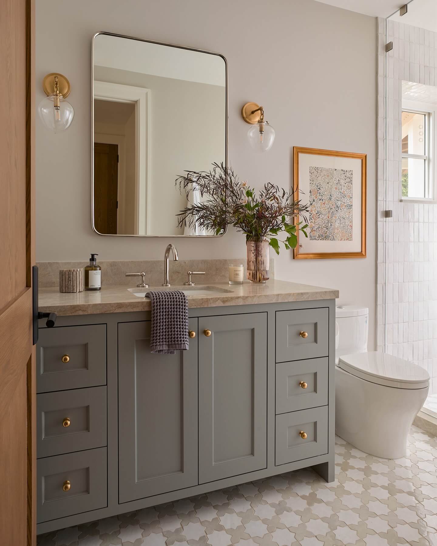
Soft Pewter Gray with Mixed Metals
When charcoal feels too strong and light gray too safe, soft pewter offers that perfect in-between. On a bathroom vanity, it delivers tailored calm with just enough depth to anchor patterned floors or dynamic stone. Pewter’s subtle blue-green undertone pairs nicely with marble featuring cool veining and with quartz that leans warm, making it a versatile neutral across different lighting conditions. Embrace mixed metals to keep the look layered: matte black pulls for contrast, polished nickel faucets for shine, and a warm brass mirror to add a touch of glow. Keep walls airy—mineral white or pale greige—and let texture carry the interest: fluted drawer fronts, ribbed glass doors, or reeded details feel elevated in this shade. For small bathrooms, choose a higher-sheen satin finish to reflect light; in larger spaces, a low-luster enamel reads luxe and calm. Pewter also excels with geometric tile, terrazzo, or slate floors, offering enough presence without vying for attention. This is one of those bathroom vanity color ideas that adapts gracefully from modern to transitional, especially when styled with layered towels and streamlined sconces.
Aubergine Vanity, Jewel-Tone Drama Done Right
Aubergine—an inky eggplant—channels rich sophistication without tipping into trendy purple. As a bathroom vanity color, it adds couture depth, especially in powder rooms where drama is welcome. The trick is balance: keep surrounding elements restrained so the vanity remains the star. Pair aubergine with white marble, creamy quartz, or even a subtly veined dolomite for crisp contrast. Hardware in unlacquered brass or antique gold brings warmth; polished nickel lends gallery-like clarity. For walls, consider a soft plaster white or microcement gray; if you love cocooning color, go tonal with a paler mauve-gray on the walls and crisp white trim. Lighting matters—warm LEDs reveal the shade’s complexity; too cool and it can read flat. A lacquered finish telegraphs high-glam, while satin skews modern and understated. Add ribbed glass sconces, a statement mirror, and restrained accessories to avoid a palette overload. This hue plays beautifully with patterned marble floors and herringbone tile, delivering a boutique-hotel moment that still feels timeless within your bathroom vanity color ideas lineup.
Driftwood Gray Oak for Airy Coastal Texture

If you love the warmth of wood but prefer a lighter, beach-glass vibe, driftwood gray oak is the sweet spot. A weathered, desaturated stain on rift- or quarter-sawn oak highlights linear grain while muting yellow undertones—ideal for coastal, Scandinavian, or organic modern bathrooms. As a vanity finish, it brings texture without heaviness and pairs effortlessly with crisp whites, pale stones, and soft blues. Consider honed Carrara or white quartz to keep the look fresh, and add brushed nickel or stainless hardware for a sleek, salt-air feel. For walls, mineral whites or foggy grays maintain serenity; beadboard or vertical paneling adds subtle rhythm. Tile choices that sing: pearl-toned zellige, porcelain “limestone,” or micro-mosaic marble. Protect the stain with a waterborne matte polyurethane for moisture resistance without plastic shine. To prevent the palette from going cold, layer in woven baskets, linen towels, or a light oak mirror frame. This finish is a natural addition to bathroom vanity color ideas that prioritize texture, durability, and a bright, breathable atmosphere.
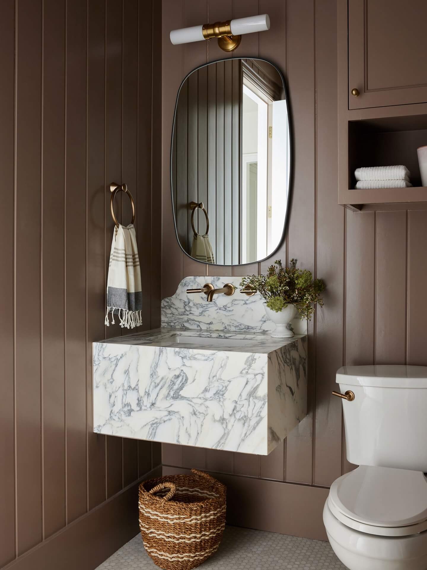
Rich Mocha Brown for Cozy Sophistication
Mocha brown is the modern answer to traditional espresso—deep and chocolatey but with warmth that reads inviting rather than severe. On a bathroom vanity, it delivers grounded elegance and a cozy counterpoint to bright stone and white walls. This shade pairs beautifully with warm-veined quartz, Calacatta marble, or creamy dolomite; it also looks striking against terrazzo with brown and gray chips. Hardware choices set the tone: brass elevates and warms, while matte black sharpens the silhouette for a contemporary look. Keep walls soft (oyster, warm white, or pale greige) so the vanity feels intentional, not heavy. A satin or semi-gloss finish adds depth and durability, especially in high-traffic primary baths. To avoid a flat read, introduce texture—fluted drawer fronts, shaker detailing, or beveled edges—and balance with light floors or a large-format tile in sand or stone. Mirrors with wood or brass frames and linen shades on sconces complete the layered, boutique feel. Among bathroom vanity color ideas, mocha is a versatile classic that adds richness without the starkness of black.
Soft Black Vanity with Veined Marble Contrast
If you love crisp contrast but want something more nuanced than jet black, try a soft black vanity with a hint of charcoal. This bathroom vanity color idea delivers instant sophistication and makes veining in marble or quartz pop. Choose a satin or semi-gloss finish to resist moisture and fingerprints, and consider rounded edges or reeded drawer fronts to keep the look warm, not stark. Polished nickel or unlacquered brass hardware both work—nickel for cool elegance, brass for cozy glow. Pair with crisp white walls, microcement, or pale plaster to give the cabinet color room to breathe. In small bathrooms or powder rooms, lean into reflective elements: high-sheen stone, glass sconces, and a beveled mirror to bounce light. For floors, a mini checkerboard or tumbled limestone adds texture without fighting the palette. Sample a few paints with different undertones—warm charcoal reads luxe with creamy counters; cooler blacks skew modern with icy marble. This deep neutral anchors tile patterns, patterned rugs, or art, letting you refresh accents seasonally while your vanity remains the timeless focal point.
Dusty Sage Green with Brushed Pewter Accents
Dusty sage is the softer, sunlit cousin of deep forest—calming, organic, and endlessly versatile. As a bathroom vanity paint color, it bridges warm woods and cool stones, making it a natural fit for travertine, tumbled limestone, or handmade zellige. Keep the look elevated with brushed pewter or aged nickel hardware; these cooler metals temper green’s warmth for a balanced, collected feel. On the walls, try warm white with a touch of cream, vertical beadboard, or a subtle clay-lime finish to add depth. In a small bath, an off-white shower curtain and pale grout keep everything light; in a primary suite, layer a textured runner and linen Roman shade for softness. Aim for 2700–3000K lighting so the sage doesn’t skew minty under cool bulbs. If you’re pairing with patterned floors, choose a stone-heavy mix—greiges, bone, and soft gray—so the cabinetry remains the hero. This hue delivers spa-like serenity without feeling flat, an ideal middle ground if you’re moving from neutrals into color but still want a palette that plays nicely with the rest of your home.
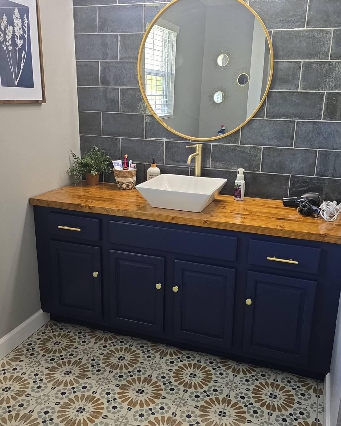
For tailored drama that still reads classic, go inky navy on the vanity and echo the tone with polished nickel. The blue’s depth sharpens profiles, fluted fronts, and inset panels, while nickel brightens edges for a crisp, hotel-bath finish. This bathroom vanity color idea is a slam dunk with Carrara or statuary marble, white quartz, or even a delicate gray soapstone. To keep the palette coherent, repeat navy in micro-doses—piping on a hand towel, a thin frame, or a narrow stripe on wallpaper. White walls with subtle texture (limewash, plaster, or beadboard) keep the space from feeling too formal. If you love pattern, try classic white subway tile with navy-tinged grout or a star-and-cross floor in chalky neutrals. Consider a high-durability enamel or lacquer in a powder room for that jewel-box sheen; in busy family baths, a wipeable satin is more forgiving. Warm bulbs and a dimmer will keep navy lush after dark. It’s elegant, photogenic, and timeless—especially where you want contrast without going all the way to black.
Mushroom Greige Vanity for Understated Luxury
Mushroom greige—somewhere between warm taupe and soft gray—delivers that quiet, “designer without trying” effect. As a bathroom vanity color, it flatters warm-veined marble, creamy quartz, travertine, and brushed brass in one fell swoop. The secret is undertone harmony: pick a greige that matches the temperature of your counters and floor tile, then echo it on the walls one or two steps lighter for a cocooning, tonal look. For hardware, mix finishes intentionally: soft brass for warmth at the pulls and a darker bronze at the faucets to add depth. Add ribbed glass or linen-shaded sconces to enhance the palette’s softness. This neutral sings with texture—waffle towels, a jute runner, fluted details, or reeded glass—rather than high-contrast color. In small bathrooms, mushroom greige prevents the boxy “builder beige” effect by leaning sophisticated, not yellow. It’s also a perfect bridge if you’re pairing cool gray tile with warmer wood mirrors or stools. The result: a relaxed, quietly luxurious bath that feels collected over time and plays well with almost any accent you bring in later.
Graphite Charcoal with White Oak Accents
Graphite charcoal is the modernist’s answer to black—deep enough for drama, soft enough to layer. Use it on the vanity and frame the mirror in white oak for instant balance: the wood lightens the mood while the dark cabinet grounds the room. This pairing shines with white quartz, milky marble, or even honed soapstone counters. For hardware, choose matte black for a minimalist route or antiqued brass to warm the palette. Keep walls bright and lightly textured—plaster, microcement, or smooth eggshell—to let the charcoal read dimensional rather than flat. Checkerboard floors in limestone and marble or a stacked vertical tile add subtle movement without stealing the show. In compact bathrooms, consider slimmer stiles and slab fronts so the deep color doesn’t overwhelm; reflective sconces and a larger mirror amplify light. Ventilation and a durable enamel finish ensure the dark paint stays looking crisp. Graphite offers everyday practicality—hides scuffs better than white—while still delivering that gallery-grade, high-contrast look designers love.
Buttercream Vanity for Sunlit Cheer
For a fresh, uplifting spin on neutrals, try buttercream—a whisper-soft yellow that reads like filtered sunshine. As a bathroom vanity color, it brings warmth to cool stone and brightens windowless powder rooms without tipping into pastel. Pair it with warm white walls, beadboard, or subtle striping for tailored charm. Unlacquered brass, champagne bronze, or even porcelain knobs enhance the vintage-leaning vibe, while a veined marble or creamy quartz countertop keeps it feeling elevated. If your floors skew gray, choose a buttercream with a hint of beige to bridge the temperature gap; with travertine, go slightly clearer for luminosity. Lighting matters here: 2700K bulbs keep buttercream flattering and cozy, whereas cooler bulbs can wash it out. Add linen cafe curtains, ticking towels, or a small patterned runner to layer in tone-on-tone interest. This color is especially lovely in guest baths and powder rooms where you want something welcoming and memorable—sunny, never loud—and it pairs beautifully with botanical prints, rattan accents, and art in soft, painterly palettes.
Oxblood Burgundy Vanity for Boutique Hotel Glamour
If your bathroom is craving high style, oxblood delivers a sultry, boutique-hotel moment. This deep burgundy vanity color radiates confidence and looks spectacular against white, ivory, or blush-toned stone. A lacquer or high-durability enamel finish amplifies the richness and makes cleaning easy. Pair with antique brass or smoked bronze hardware and consider ribbed or globe sconces for a soft, flattering glow. Keep surrounding elements restrained so the vanity remains the star: off-white walls, slim crown, and a marble or terrazzo floor with subtle movement. In powder rooms, mirror the drama with a statement frame and a single art print; in larger suites, temper the depth with sheer linen and warm wood stools. Balance is all about undertones—choose burgundy with a brown base if your tile is warm, or a wine-leaning version if your stone skews cool. It’s bold yet surprisingly versatile, and it instantly elevates everyday rituals into a design moment you’ll look forward to, morning and night.
Bold Bathroom Vanity Colors and Trend-Forward Palettes
Statement-making palettes turn the vanity into a focal point without overwhelming the room. Jewel tones like emerald, oxblood, and sapphire pair well with natural stone and unlacquered brass. Color-drenching—painting vanity, trim, and walls one shade—creates immersive drama for powder rooms. Two-tone vanities balance depth and brightness, using darker bases with lighter uppers or drawers. For wood, espresso and charcoal stains showcase grain while aligning with contemporary, hotel-inspired vibes.
- Try a high-contrast pairing: midnight blue vanity, crisp white quartz, and fluted backsplash tile, finished with polished nickel pulls and arched mirrors for refined, gallery-like symmetry.
- Embrace terracotta or clay pink on a reeded vanity front, adding earthy warmth that flatters travertine, brushed brass, woven textures, and matte plaster walls in Mediterranean-inspired baths.
- Go glossy emerald in a windowless powder room; sheen bounces light, while dark green retains sophistication beside marble mosaic floors and gold-leaf frames.
- Opt for charcoal with thin shaker rails for ultra-modern lines, then add linear sconces and a chunky mitered countertop edge to underline the clean, architectural geometry.
- Try color-blocked drawers—deep plum bottoms, mushroom uppers—so storage zones read clearly, while the palette stays sophisticated alongside limestone flooring and burnished hardware.
- Pair graphite paint with rift-cut white oak legs for warmth and shadow play, echoing terrazzo flecks and microcement walls for tactile richness without visual noise.
Durability matters with saturated hues; choose cabinet-grade enamel or catalyzed lacquer for a smoother, tougher finish. Use quality primers to block tannins on hardwoods and prevent discoloration. Coordinate hardware and faucet finishes to avoid introducing too many visual breaks across bold surfaces. Balance strong color with strategic lighting—2700K to 3000K warmth flatters skin tones and enriches pigments. Before painting, mock up the full palette with samples of tile, grout, metal, and stone under both natural and artificial light.
Color Confidence for Your Vanity Makeover
How do I pick a vanity color that works with my existing tile?
Identify the tile’s dominant undertone—warm, cool, or neutral—then match or intentionally contrast with a complementary undertone. Bring home paint chips, stone samples, and metal finishes to confirm harmony in your lighting.
What finish sheen is best for bathroom vanities?
Satin and semi-gloss are popular for balancing wipeability and subtlety. Matte looks refined but requires high-quality enamel for durability and may show water spots more readily.
Are dark vanity colors suitable for small bathrooms?
Yes, if you manage contrast and lighting. Pair dark cabinetry with light counters, bright walls, and ample sconces or backlit mirrors to keep the space feeling open.
Should hardware match faucet finishes on a colorful vanity?
Coordinating is safest, but mixing can look intentional with clear hierarchy. Choose one dominant metal and a supporting accent, repeating each finish at least twice for cohesion.
Final Verdict: Your Vanity, Your Signature Color Story
The best bathroom vanity color ideas don’t just look good—they make your space feel intentionally designed. Start by reading the room: natural light, bulb temperature, and the undertones in your tile, stone, and paint all guide the right hue. Align metals to the palette (warm brass, cool nickel, dramatic matte black), and choose a durable finish—satin or semi-gloss for everyday bathrooms, lacquer or enamel for high-impact powder rooms. Proper prep matters: quality primer, moisture-resistant paint, and a protective topcoat will keep your color crisp in humid conditions.
Build confidence with large swatches and a quick flat-lay of samples: vanity paint, stone or quartz, tile and grout, plus hardware. For calm elegance, reach for greige, mushroom taupe, or pewter; for spa vibes, try sage and dusty greens; for modern edge, explore graphite, charcoal, or soft black with veined marble; for coastal ease, slate blue-gray or driftwood oak; for boutique drama, aubergine, oxblood, or inky navy with polished nickel. Two-tone combos and wood stains add depth without clutter. In small bathrooms, airy neutrals or light blues open things up; in powder rooms, go bold. Pick the palette that complements your finishes and lifestyle—and let your vanity become the color story that elevates the entire bath.