
Farmhouse Kitchen Paint Colors That Instantly Warm Up Your Space
A farmhouse kitchen should feel like a deep breath—warm, welcoming, and a little bit timeless. The right paint colors do the heavy lifting, bringing together rustic textures, natural wood, and vintage-inspired details with an easy, modern polish. From creamy whites to moody, heritage hues, this guide helps you choose farmhouse kitchen paint colors that make your space feel both cozy and elevated.
We’ll break down the most reliable palettes—soft whites, greiges, sage and olive greens, putty taupes, inky blues, and charcoal blacks—and explain how undertones, lighting, and finishes affect the final look. You’ll learn how to pair colors with shiplap, beadboard, butcher block, soapstone, marble, and hardware like brushed brass or oil-rubbed bronze for a cohesive, lived-in vibe.
Expect practical tips, designer-approved shade ideas, and real-life inspiration that fits everything from classic country to modern farmhouse. We’ll cover LRV (light reflectance value), sample testing, and smart ways to use two-tone cabinets or a statement island so your paint choices look intentional—morning to midnight.
Best Farmhouse Kitchen Paint Colors for Cabinets and Walls
Choosing farmhouse kitchen paint colors starts with analyzing undertones and light. Warm whites and creamy ivories keep shiplap bright while avoiding hospital harshness. Balanced greige and soft gray bridge stainless appliances and reclaimed wood. Low-LRV navy and sage add grounded contrast on islands or lowers. Always view large samples vertically in multiple light temperatures. Select durable sheens: eggshell or satin for walls, semi-gloss for trim and cabinets.
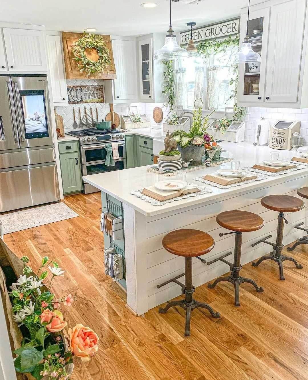
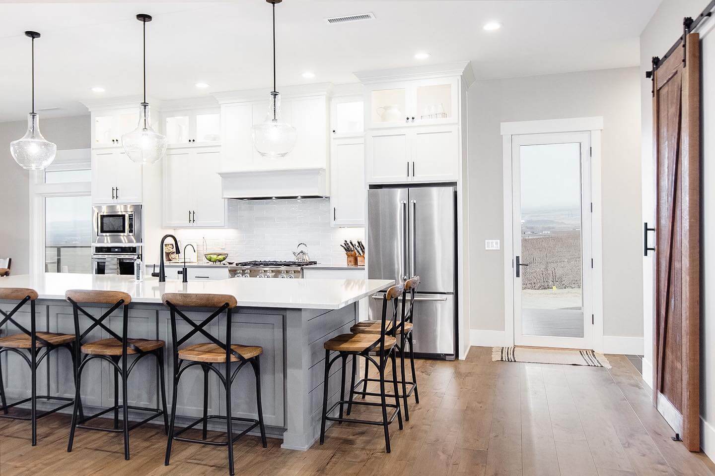
- Warm Whites: Soft, creamy whites with subtle yellow undertones reflect light beautifully, soften stainless steel, and keep shiplap, subway tile, and butcher block looking cohesive without appearing sterile.
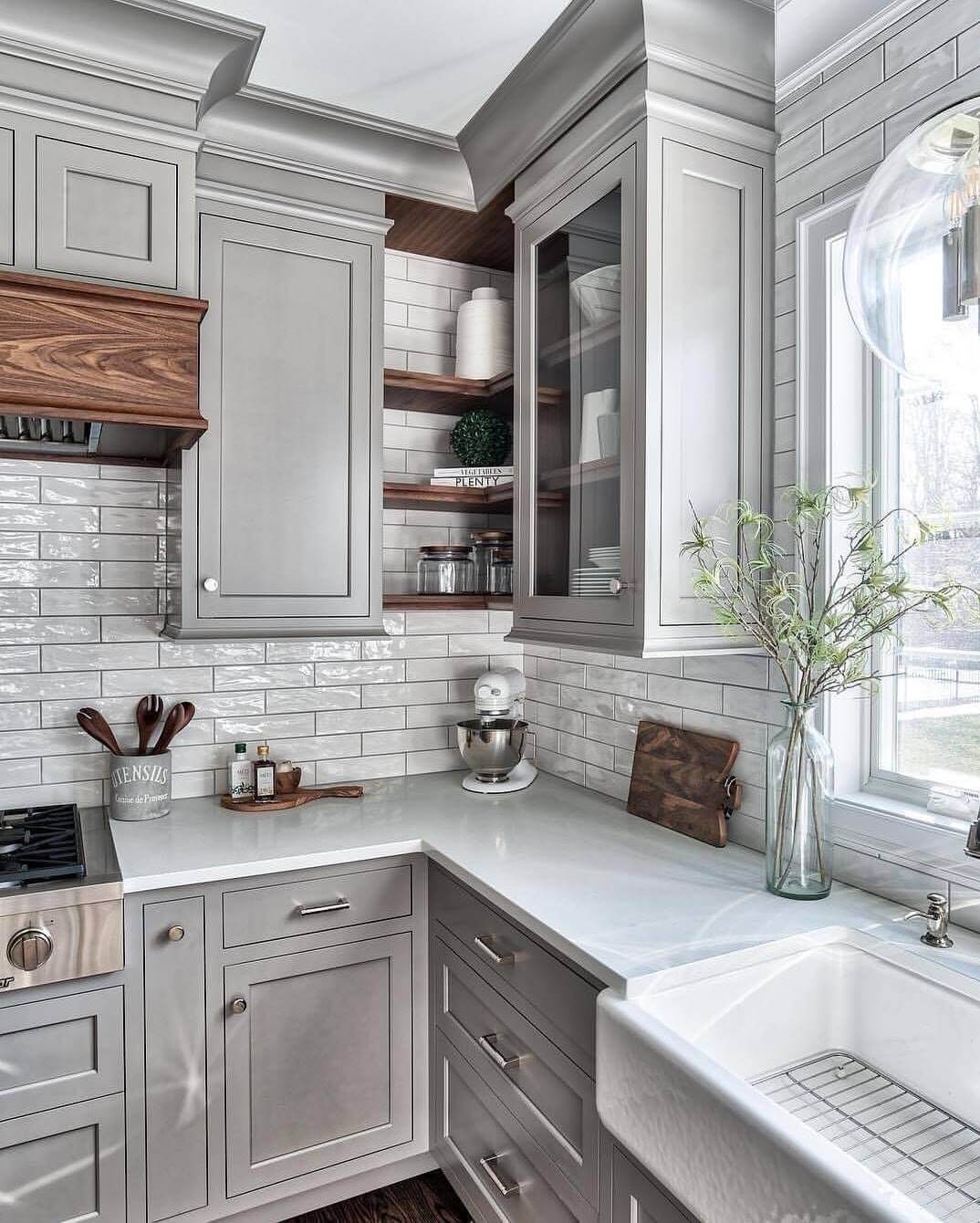
- Greige Neutrals: Balanced greige shades bridge warm wood tones and cool appliances, minimizing clashing undertones while adding depth; they read timeless beside Carrara marble, soapstone, or honed quartz countertops.
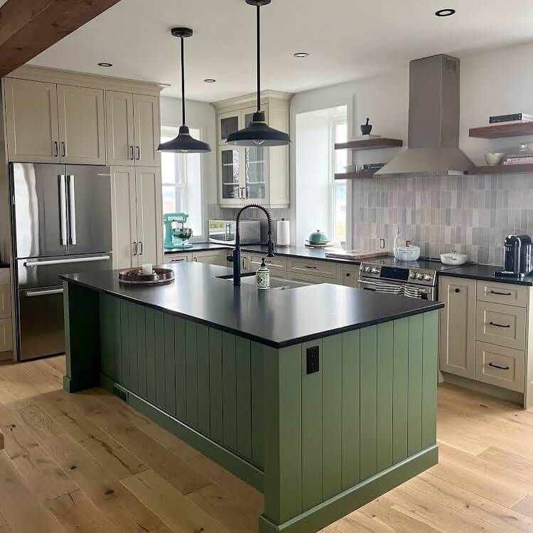
- Earthy Greens: Desaturated sage and olive evoke garden freshness, complement copper accents and terracotta tiles, and balance knotty pine or oak cabinetry without overpowering narrow galley kitchens or cozy breakfast nooks.
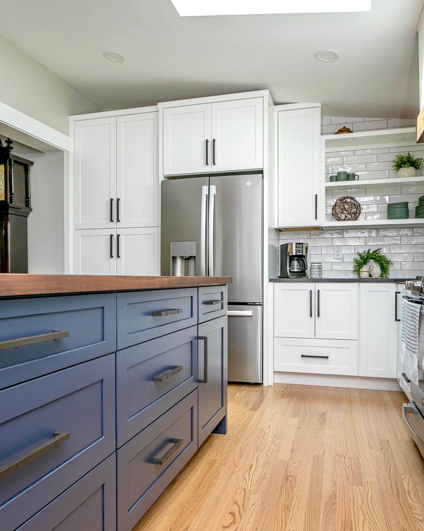
- Moody Blues: Inky navy island or lower cabinets ground the room, frame white quartz, and spotlight brass hardware; choose low-LRV blues to add depth without swallowing natural morning light.
Coordinate hues with fixed elements before painting. Butcher block loves creamy whites and greens, while cool marble prefers blue-gray or greige without muddy beige undertones. Classic white subway tile tolerates most palettes, but handmade zellige can skew warmer. Consider hardware metals: black sharpens cool schemes, aged brass enriches warm ones. Use a deeper island color to ground the room and hide scuffs. Carry the wall color into adjoining mudrooms or pantries for seamless flow.
Creamy Whites That Feel Collected, Not Clinical
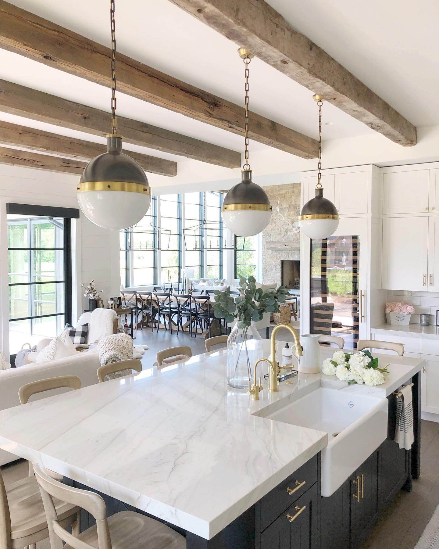
When you picture a farmhouse kitchen, a warm white backdrop is often the secret to that sunlit, lived-in charm. Choose a creamy white with a touch of beige or butter in the undertone so it reads cozy rather than sterile. High-LRV whites (around 78–88) bounce light beautifully across shiplap, beadboard, and plaster, softening the room in morning and evening light. Pair creamy walls with natural wood—think butcher block, oak floors, and pine shelves—to let the grain glow. For cabinets, a satin or enamel finish keeps things wipeable without the glare of semi-gloss. Worried about mismatched whites? Keep trim and ceiling a half-step lighter than the walls so everything harmonizes without looking flat. Hardware in unlacquered brass or oil-rubbed bronze completes the palette with an heirloom note. Countertops can swing classic (soapstone or honed marble) or low-maintenance (matte quartz with gentle veining). The result is a collected farmhouse kitchen paint scheme that feels fresh in daylight and lantern-warm after dark—never stark, always welcoming.
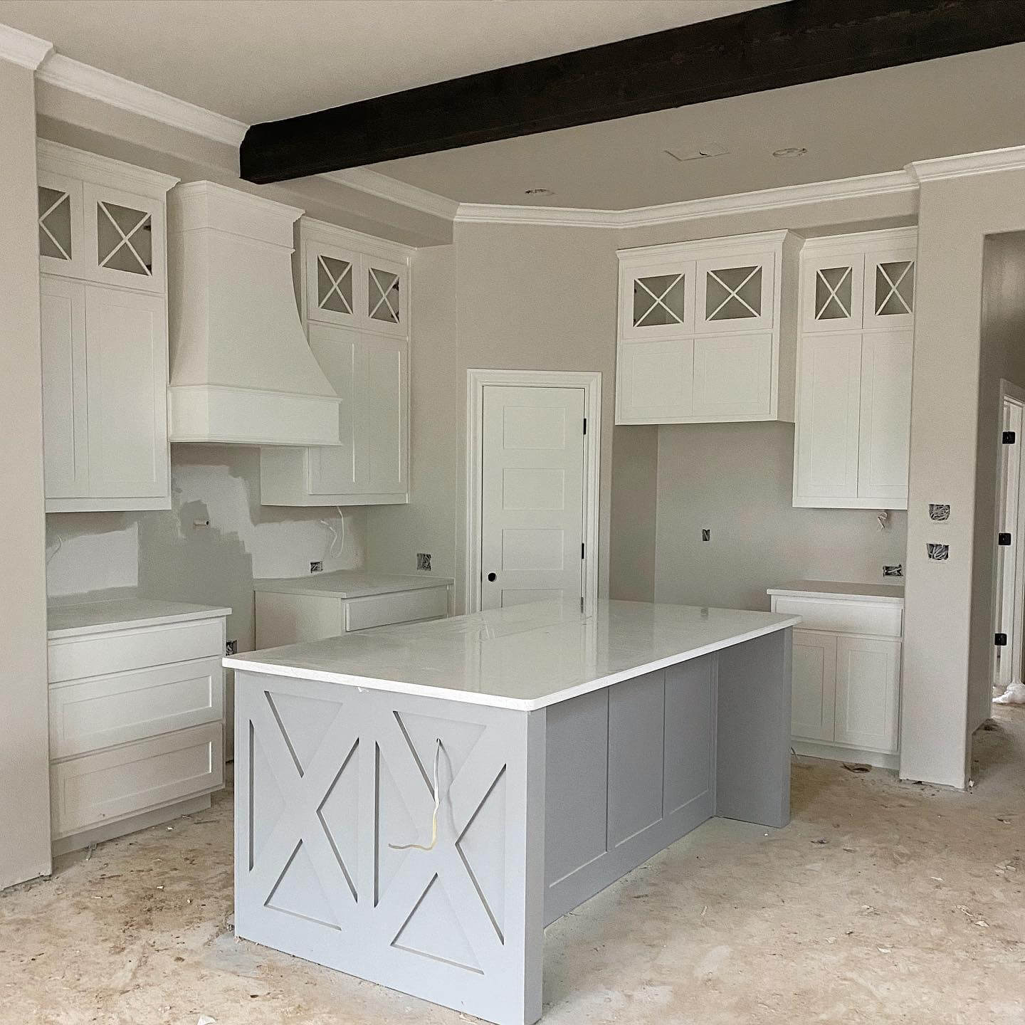
Greige Cabinets: The Workhorse Neutral
Greige—where gray meets warm taupe—is a powerhouse for farmhouse kitchens because it plays nice with everything. On cabinetry, choose a mid-LRV greige (about 40–55) that has a soft, earthy undertone; it grounds the room without feeling heavy. In north-facing spaces, a faint green or taupe undertone keeps greige from going cold, while south-facing kitchens can handle a dustier, more muted version. Keep walls a creamy off-white for contrast and let the backsplash—subway tile, beadboard, or zellige—supply texture. Greige pairs equally well with soapstone, honed marble, or pale quartz, and it’s stunning with mixed metals: brushed brass for warmth, aged nickel for restraint, and black hardware for crisp punctuation. If your floors have orange or red warmth, greige balances them, preventing the room from reading too yellow. Add a putty-colored range hood or pantry door to layer tone-on-tone depth. The beauty of greige cabinetry is longevity—this neutral adapts to changing accents and seasons while delivering that calm, heritage farmhouse feel.
Sage and Olive Greens for Herb-Garden Calm
Sage and olive greens are the quiet heroes of farmhouse kitchen paint colors—earthy, familiar, and flattering to wood and stone. Whether on lower cabinets, a pantry door, or a freestanding hutch, these greens bring garden energy inside without shouting. Look for muted, gray-leaning sages for an airy mood or olive with a warm yellow undertone for richness. They sing alongside butcher block, terra-cotta, and brick, and they’re equally at home with polished marble or rustic soapstone. Keep walls soft white or putty to let the greens breathe; finish with aged brass, iron, or pewter hardware for an authentic, timeworn look. If your kitchen has a lot of natural light, you can go a shade deeper to prevent washout; in lower light, stay mid-tone for clarity. A sage island beneath globe pendants or an olive hutch with farmhouse ceramics adds just the right measure of color while preserving the calm, collected spirit of the modern country kitchen.
Putty Taupe on Shiplap for Instant Age
Putty taupe is the shortcut to patina. On shiplap or beadboard walls, this clay-like neutral reads soft and storied—perfect for a farmhouse kitchen that leans classic without feeling fussy. Aim for an LRV in the 45–55 range; it’s deep enough to show the texture of paneling yet light enough to keep the room airy. Pair putty walls with warm white cabinets so the joinery pops, or flip the script with putty cabinetry and creamy walls for a cocooned effect. Stone and metal love this color: think honed limestone or soapstone counters, a brushed nickel bridge faucet, and iron sconces. Because putty taupe bridges brown and gray, it tames red and orange wood tones and plays beautifully with woven textures and natural fiber rugs. If you want a gentle accent, paint interior doors or the range hood a shade darker than the walls to add subtle depth. The overall palette feels heritage-rich but effortlessly livable.

A deep, inky navy island can anchor a farmhouse kitchen like a vintage stove—handsome, practical, and worthy of attention. Keep perimeter cabinets a warm, creamy white so the island becomes the color hero, and echo the blue with a stripe in a runner or a stack of stoneware. Navy skews cooler than black but still delivers gravitas, especially in a satin or matte enamel that hides scuffs. It’s a natural partner for honed marble or pale quartz with gray veining, and an absolute showstopper beneath brass or copper pendants. For cohesion, choose a navy with a whisper of gray so it behaves like a neutral; then tie it to the backsplash with inky grout or a slate-toned tile. If your kitchen leans rustic—exposed beams, butcher block, open shelves—navy keeps the look edited and modern while preserving warmth. It’s a confident, family-friendly way to add color that still feels timeless and farmhouse through and through.
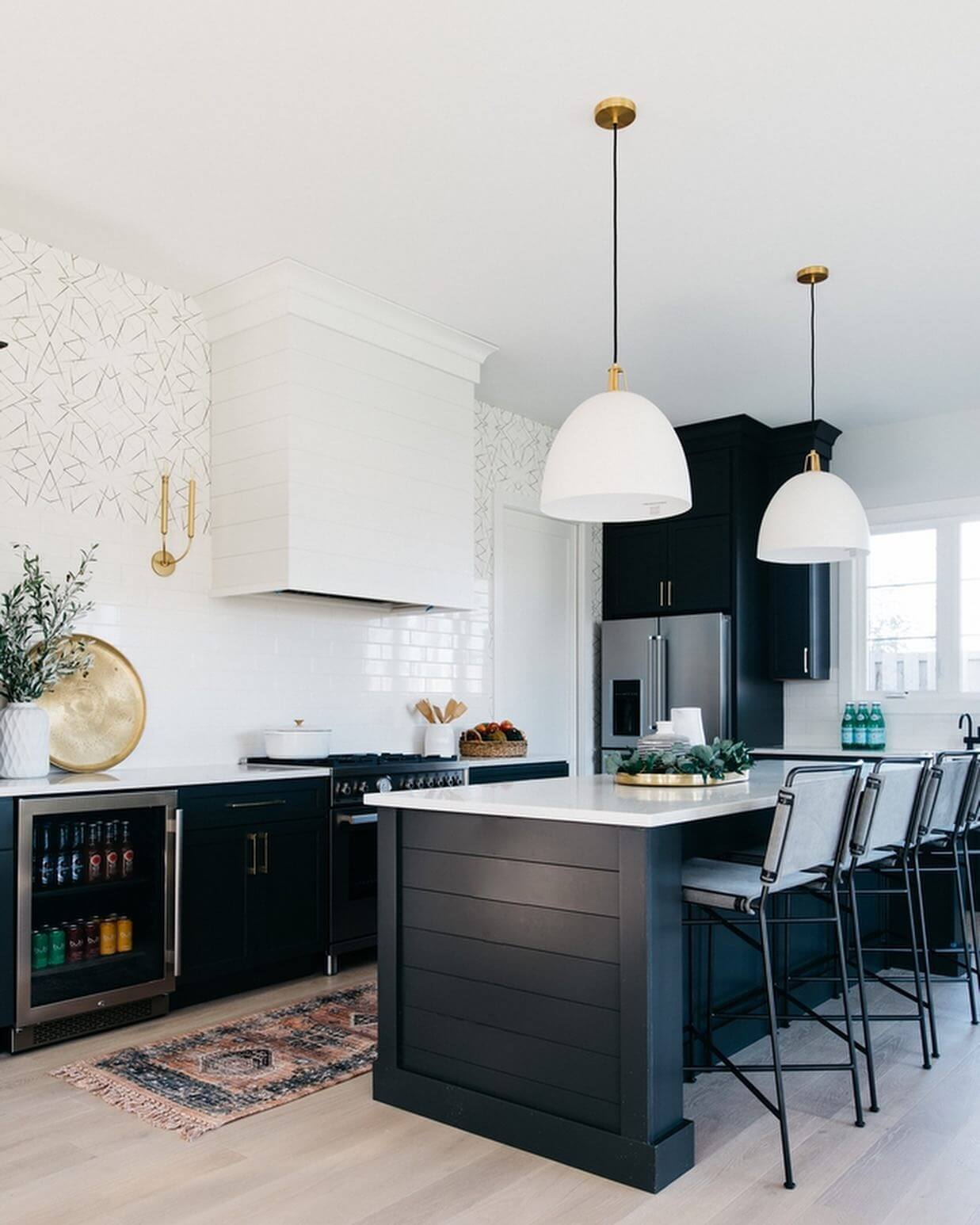
Charcoal and Soft Black for Modern Farmhouse Edge

For farmhouse kitchens that skew modern, charcoal and soft black are the moody counterpoints to white walls and natural wood. Instead of a stark, blue-leaning jet black, opt for a sootier charcoal or off-black with a brown or green undertone—these read richer and more layered. Use it on lower cabinets, a statement range hood, or a bank of tall pantry doors to ground the space. Contrast is key: crisp white or cream walls keep the palette breathable, while open oak shelves and butcher block prevent the darkness from overwhelming. Match metals thoughtfully—antique brass warms charcoal; gunmetal or blackened steel keeps it cool. Matte or satin finishes feel tactile and help disguise fingerprints. Pair with stone that has movement (veined marble, quartzite, or soapstone) so the surfaces feel dynamic rather than flat. The result is a handsome, hardworking kitchen that blends farmhouse soul with a refined, contemporary edge.
Mushroom and Stone Gray for Trim, Doors, and Built-Ins

If bright white trim feels too crisp, try mushroom and stone-gray paints on doors, window casings, and built-ins. These earthy mid-tones add age and architecture to farmhouse kitchens, especially alongside creamy walls and natural beams. Choose a shade with a warm taupe base so it doesn’t read cold; an LRV in the 30–45 range adds definition without turning gloomy. Painting the interior of a glass-front hutch in stone gray highlights pottery and copper beautifully; a mushroom pantry door looks custom even in a simple layout. Mix with honed stone counters and soft nickel or pewter hardware for a layered, European-country feel. This palette tames busy wood grains and creates a gentle bridge between white walls and darker floors. Bonus: it’s forgiving in high-traffic zones—scuffs and fingerprints blend in. It’s a subtle move with major payoff, delivering that “was this always here?” authenticity every farmhouse kitchen craves.
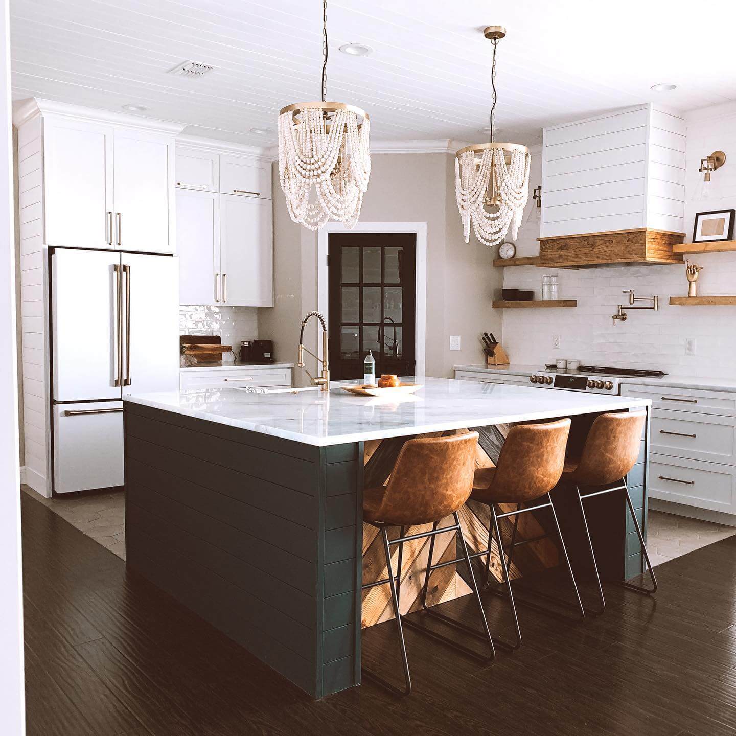
Two-Tone Cabinetry That Looks Intentional

Two-tone cabinetry is a farmhouse staple when you treat it like a palette, not a trend. Anchor the room with deeper lowers (greige, sage, navy, or charcoal) and keep uppers or the hutch a warm white so sightlines stay open. The trick is undertone harmony: if your lowers lean warm (olive, taupe), choose a creamy white; if they skew cool (blue-gray, charcoal), pick a soft white with a gray cast. Repeat the deeper color once—on an island, hood, or pantry door—to make it feel purposeful. Tie everything together with a backsplash that supports both tones, like handmade white tile with warm grout or a light stone with subtle veining. Use consistent sheens—satin or matte for cabinets, eggshell for walls—and repeat metal finishes in at least three places (hardware, lighting, faucet) for cohesion. Done right, two-tone paint reads curated and timeless, giving your farmhouse kitchen dimension without visual clutter.
Ceiling and Trim: The Quiet Color Composers
Don’t sleep on ceilings and trim—they’re the quiet composers of a farmhouse kitchen palette. A ceiling one or two steps lighter than the walls lifts the room; in spaces with beadboard overhead, consider color-drenching walls and ceiling in the same soft hue for a cozy, cabin-like feel. For trim, pick a white that shares the wall’s undertone: creamy with warm neutrals, linen-white with taupes, or soft gray-white with cooler palettes. Use semi-gloss on trim and doors for durability; keep walls eggshell and ceilings flat to hide imperfections. If your cabinetry is colorful (sage, navy, charcoal), let the ceiling go whisper-light to balance. Conversely, in all-white kitchens, a putty or mushroom trim adds instant character. This subtle coordination ensures your farmhouse kitchen paint colors look intentional from crown molding to baseboards, making every surface—from shiplap to stone—feel part of a single, thoughtful story.
Test Like a Pro: LRV, Undertones, and Sheen
Great farmhouse kitchen paint starts with smart testing. Paint sample boards (at least 18×24 inches), move them around the room, and read them morning to night. Check LRV so you know how much light a color reflects; higher LRVs keep small kitchens bright, while mid-tones add mood without heaviness. Study undertones against fixed elements: flooring, countertops, backsplash, and even your appliances. If your quartz is cool, a greige with a green undertone might go muddy; if your floors are warm, creamy whites and olive greens will sing. Always test sheen: satin or enamel for cabinets (wipeable, soft glow), eggshell for walls (forgiving, subtle), and flat for ceilings. Prime first if painting over stained wood so undertones don’t bleed. Finally, confirm metals in your lighting and hardware work with the palette—brass warms whites and greens; nickel complements grays; matte black sharpens everything. This simple process ensures your farmhouse palette stays cozy, cohesive, and timeless.
Buttercream Walls for Sunlit Farmhouse Warmth
If stark white feels too crisp for a lived-in kitchen, try a buttercream wall color that reads soft and sunlit. These warm, creamy farmhouse kitchen paint colors bridge bright daylight and the golden tones of butcher block, pine, or oak. Look for gentle yellow undertones without veering banana—think Benjamin Moore Creme Fraiche or Sherwin-Williams Dover White, or sample Farrow & Ball White Tie for a delicate, old-world cast. In north-facing rooms, the slight warmth counters cool light; in south-facing kitchens, it glows but stays grounded when paired with honed marble, soapstone, or a clay tile floor. Keep cabinets in a mellow greige or mushroom to avoid competing undertones, and invite cohesion with unlacquered brass bin pulls and a patinated bridge faucet. Aim for an eggshell or matte wall sheen to maintain a chalky, farmhouse feel; reserve satin for high-splash zones. Pro tip: check the LRV (around 75–85) to keep the room bright but cozy, and test large swatches near wood elements to ensure the cream doesn’t skew too yellow. The result is a collected, heirloom warmth that flatters shiplap, beadboard, and open shelving in a single, effortless palette.
Blue-Gray Cabinets with Soapstone for Honed Heritage
For a timeless nod to heritage kitchens, blue-gray cabinetry paired with soapstone countertops is a winning farmhouse combo. These nuanced farmhouse kitchen paint colors—think Farrow & Ball De Nimes, Benjamin Moore Boothbay Gray, or Sherwin-Williams North Star—deliver a chalky, desaturated blue that behaves like a neutral. The cool cast balances the warmth of butcher block or vintage rugs and plays beautifully with aged brass cup pulls and schoolhouse lighting. Opt for a satin or matte enamel on cabinets to echo the honed finish of soapstone or leathered granite; high gloss can feel too formal. Because blue-grays shift with light, sample across morning and evening, and watch how the hue deepens against white oak floors and creamy walls. If your space needs extra warmth, add putty or mushroom on the island or install beadboard backsplash in an off-white with a touch of gray. The mix reads collected rather than matched, letting the blue-gray ground the room while metals and woods add soul. It’s an easy way to make a new kitchen feel storied—calm, substantial, and quietly sophisticated.
Clay Terracotta on a Pantry Door for Earthy Warmth
A single hit of clay terracotta can transform a farmhouse kitchen without repainting every cabinet. Try it on a pantry door, range hood, or freestanding hutch for earthy, sunbaked warmth that complements sage, greige, and putty. Shades like Farrow & Ball Red Earth, Sherwin-Williams Redend Point, or Benjamin Moore Terra Cotta Tile bring a mellow, mineral quality—more pottery studio than pumpkin spice. The trick is balance: keep surrounding walls creamy and the main cabinets in a soft neutral so the clay reads intentional. Layer in copper or antique brass, woven textures, and a saltillo or tumbled brick floor if you want extra rustic depth; or cool it down with soapstone and nickel for a modern farmhouse take. Terracotta’s medium LRV keeps it cozy, so consider glass inset doors or open shelves nearby to maintain visual lightness. For durability, choose a scrubbable satin on doors and a flat or matte on adjacent walls. This targeted color story gives you seasonal versatility too—greens and evergreens feel classic in winter, while linen and wicker keep it breezy in summer.
Wheat-Yellow Islands That Glow at Golden Hour
If you love the idea of yellow but fear a primary crayon effect, aim for wheat: a softened, straw-toned yellow that behaves like sunshine in paint form. On a farmhouse kitchen island, it radiates warmth without shouting, especially against creamy walls and soft black or nickel hardware. Test hues like Farrow & Ball Hay, Benjamin Moore Weston Flax, or Sherwin-Williams Blonde—each carries a touch of brown for an earthy, grounded read. Wheat works with butcher block, travertine, or honed marble by echoing natural stone veining and wood undertones. Keep uppers quiet in warm white or mushroom so the island becomes the friendly focal point. Because yellow lifts in bright light, sample at different times of day to ensure it doesn’t skew lemon—adding a drop of gray or beige in your custom mix can tame intensity. Finish with a tough cabinet enamel in satin for wipeability while preserving that farmhouse, hand-brushed look. The payoff: a kitchen that feels perpetually lit by late-afternoon sun—inviting for coffee at dawn and candlelit suppers alike.
Rosy-Beige Walls That Read Neutral, Not Pink

Rosy-beige is the secret sauce when plain greige feels flat. With a whisper of blush, these farmhouse kitchen paint colors warm up white cabinetry, walnut shelves, and oil-rubbed bronze without turning overtly pink. Try Farrow & Ball Setting Plaster, Sherwin-Williams Malted Milk, or sample a custom mix by adding a touch of red oxide to your favorite beige. The undertone softens cool light in north-facing kitchens and flatters natural stone from Calacatta to soapstone. Pair with putty or mushroom lowers, creamy uppers, and a natural linen roman shade for a layered, textural look. Keep the sheen matte or eggshell on walls for a plaster-like depth; reserve satin for trim and beadboard. Because subtle reds can spike under warm bulbs, test with your nighttime lighting and next to cookware and textiles you actually use. If you want more contrast, add a slate blue or charcoal island; if you prefer cohesion, choose brushed brass and cane or wicker stools to echo the warmth. The result is an elevated neutral that feels storied and softly luminous.
Milk-Paint Cabinetry for Soft, Chalky Patina
For true farmhouse character, consider milk-paint finishes on cabinetry, hutches, or a built-in bench. The chalky, velvety texture diffuses light and lends instant age, especially in shades like putty, thyme, or weathered blue. True casein milk paint can be layered and burnished for a timeworn look; acrylic “milk paint” lines (like General Finishes) offer easier application and durability. Use a bonding primer for previously finished cabinets, then finish with a matte waterborne topcoat to preserve the tactile, low-sheen glow. Color-wise, pick desaturated hues with gray or brown in the base—think ash green, river stone, or heirloom blue—to keep the palette sophisticated. Pair with beadboard, latches, and cup pulls in antique brass or black and consider a farmhouse sink with an apron front to complete the story. Because milk paint can appear lighter when dry, brush generous sample boards and test next to countertops and floors. This approach lets you blend new and vintage pieces seamlessly, delivering a kitchen that feels collected, not coated—rich in patina, easy on the eyes, and wonderfully low-maintenance.
If inky navy feels too formal, slate blue brings a gentler, weathered note to farmhouse kitchen cabinetry and islands. With gray at its core, slate blue acts like a colored neutral—calm against creamy shiplap and warmly contrasted by butcher block or European oak. Start with samples like Sherwin-Williams Storm Cloud, Farrow & Ball Oval Room Blue, or Benjamin Moore Blue Note cut with 25% gray to desaturate. Slate excels alongside honed soapstone, stainless ranges, and aged brass hardware, creating that “heritage but lived-in” balance. Use satin on cabinets to resist fingerprints while keeping the finish quiet; an eggshell on surrounding walls maintains depth without glare. Watch undertones: some slates lean green, others violet; pull in a runner or tile that shares the bias to unify the palette. For a fresh twist, paint the interior of glass-front uppers in the same slate so your pottery pops. The overall effect is grounded and serene—classic farmhouse bones with a softer, more nuanced color statement than straight navy.
Blue-Green “Seaglass” Lowers for Fresh-Farmhouse Calm
Blue-green “seaglass” cabinet lowers deliver an airy, collected feel that still reads neutral. These farmhouse kitchen paint colors—Benjamin Moore Beach Glass, Quiet Moments, or Sherwin-Williams Sea Salt—shift gracefully with light, sometimes more blue, sometimes more green. The chameleon quality pairs beautifully with creamy uppers, beadboard backsplashes, and matte nickel or polished nickel hardware. To avoid a beachy cliché, ground the palette with warm textures: butcher block, terracotta, or a jute runner. Because seaglass hues carry higher LRV than deeper blues and greens, they keep small kitchens bright while providing just enough color to frame soapstone or marble veining. Choose a satin cabinet enamel for resilience, and consider matching the island or range hood a touch darker (think BM Healing Aloe’s deeper neighbor or SW Comfort Gray) for layered depth. Evaluate undertones next to your floors—seaglass can turn mint against orange oak; a brief stain refresh or a lighter rug can neutralize the clash. The result is easy-going calm that plays nicely with seasonal linens and garden herbs.
Greige-Green “Lichen” Built-Ins to Bridge Wood and Stone
When your kitchen mixes warm woods with cool stone, a greige-green—often called lichen—acts as the perfect bridge on built-ins, hutches, or a mudroom-adjacent cabinet run. Farrow & Ball Lichen, Sherwin-Williams Evergreen Fog, or a muted custom mix of gray and olive create an earthy neutrality that flatters butcher block, soapstone, and tumbled marble alike. The quiet green undertone brings herb-garden calm without reading overtly colorful, making it ideal for open-concept spaces where the palette must flow. Finish in satin for wipeability; add beadboard backs and brass latches for character. Because lichen tones can swing with light, sample across daylight and under warm bulbs—if it turns too green, cut with 10–20% gray; if it feels flat, nudge in a drop of yellow ochre. Pair with warm white walls and soft black window trim for definition, or introduce a putty taupe island to echo grout and stone veining. This is a designer-favorite move for farmhouse kitchens that need harmony: a single, sophisticated color that ties every material together, morning to midnight.
Modern Farmhouse Kitchen Paint Color Schemes and Accent Pairings
Modern farmhouse kitchen paint color schemes balance rustic warmth with crisp lines. Two-tone cabinets—light uppers and deeper lowers—keep sightlines open while adding depth. A contrasting island acts like furniture, welcoming stools and defining circulation. Beadboard or shiplap accents painted a mid-tone tie backsplashes and flooring together. Sample colors alongside grout, curtains, and range hoods to prevent mismatches. Evaluate how morning sun versus pendants shift perceived temperature.
- Pair creamy white uppers with deep green lowers, then echo the green on window mullions; the contrast sharpens wood grain on open shelves and anchors patterned vintage runners.
- Soft greige walls meet natural oak cabinets and matte black hardware; add putty-colored beadboard on the peninsula to connect barstools, woven shades, and warm brass task lighting.
- Choose dusty blue doors with antique pewter knobs, keep trim off-white, and install handmade zellige backsplash; the palette reads coastal-farmhouse without feeling theme-y or clashing with galvanized accents.
- Blend mushroom taupe islands with chalky white walls and soft gray range hoods; the muted trio flatters veined quartzite and creates a serene backdrop for herbs, pottery, and copper cookware.
Texture magnifies color, so pair chalky paints with matte tile and brushed metals. Choose washable, scrubbable formulas to handle cooking splatters without burnishing marks. In small kitchens, stick to high-LRV walls with saturated accents on islands, doors, or stools. Avoid blue-grays with strong purple undertones if your floors are orange-toned oak. For cohesion, repeat an accent on window trim or pantry doors. Dimmer controls and warm LEDs prevent whites from reading cold at night.
Color-Confident Farmhouse Kitchens: Quick Answers
What paint finish works best for farmhouse kitchen cabinets and walls?
Use durable semi-gloss or satin for cabinets and trim to resist moisture, smudges, and frequent cleaning. Choose eggshell or satin for walls to hide minor texture yet remain washable.
How do I pick the right white without it looking stark?
Compare large swatches in daylight and under your evening bulbs, next to counters and backsplash. Favor warm whites with soft undertones if your space has cool marble or northern light.
Which accent color pairs well with butcher block and stainless appliances?
Sage or olive green complements the warmth of wood while softening stainless. Navy also works, grounding the room and highlighting brass or black hardware for crisp contrast.
Do small farmhouse kitchens need lighter paint colors to feel bigger?
High-LRV wall colors expand perceived space, but you can still add depth with a darker island or door. Keep contrast controlled and repeat accents to maintain visual continuity.
Final Verdict: A Cozy, Collected Palette That Lasts
The most inviting farmhouse kitchens are built on layered, natural color stories—think creamy whites, hardworking greiges, herbaceous greens, putty taupes, and deep anchors like navy or soft black. Let your fixed elements lead: match undertones to your wood species, flooring, and countertops, then fine-tune with LRV so the room doesn’t wash out by day or cave in at night. Use sheen strategically—eggshell or matte for walls, satin or semi-gloss for cabinets and trim—and lean on two-tone cabinetry or a statement island to give structure and rhythm without visual clutter.
Keep the process simple and intentional. Shortlist three to five shades, brush large samples on poster board, and live with them from morning to midnight under your actual lighting. Hold them against shiplap or beadboard, butcher block, soapstone, or marble, and your hardware—brushed brass, polished nickel, or oil-rubbed bronze. Aim for a tight palette repeated across walls, cabinetry, trim, and doors so the space feels cohesive, not curated to death. When in doubt, pair a warm, creamy white with one grounded, muddy hue—sage, lichen, slate blue, or charcoal—and let real-life patina do the rest. That’s the recipe for a farmhouse kitchen that feels timeless, welcoming, and quietly elevated.